So how is Wednesday for you today. how's this Wednesday for you so far. So far, so good, well okay let's try and. keep on that on that path. Okay, so let me. Let me do something that you can see. Any questions or concerns from last day about the empathy map. we're specifying your own breakout room. Join.
Professor I have a question regarding the assignment and this empathy map, so you already posted this empathy map on I think for a task. So is it mandatory for assignment one to include empathy map, or we are supposed to choose your own topic in that experiment section like what to design the activity design.
Okay. So, yes you're going to do an empathy map. So the idea of creating the. exercise for students, so you. you're given you're taking the role of teacher. And you're going to create an activity or you're going to add a new activity. From your courses. Quote unquote an activity. that's called that way in the interface on the. We go to the. course here are living the teacher. So it says add an activity or resource, so the idea is you're going to add an activity and the resource. we're going to put conditions on them so that that's what you're going to do as a teacher for. Class about whatever you like the teaching a class on some subject you're going to use your courses you're going to have an activity. yeah and the resource so click on there. What button, you can see. click on the activities tab you can see, the selection of activities that are available to choose. And then here's a list of resources, so there are fewer resources. So we're going to add an activity ended as ours, with some constraints. So. Then, when you're creating the empathy map and reflecting on the task. of creating the. content of your section. you're going to. Put yourself in the in this in the Center of the empathy map. i'm doing it right for me, then, I can say. I can say what I do in the process of. Setting up. The contents of my section. When I think. When I feel when I say. So you're doing it by yourself, you may not. Talk to yourself a lot. So you can maybe think about asking yourself some questions. If you're talking to somebody else. So we can have. If we're looking at other people interacting with systems, you might ask them to. Use what's called a think aloud protocol. So I picked this because it looks like the best choice for me. So. i'm curious why I move my hand the lights the among camera. I think I think the two things aren't related.
Well, at some is because of the camera capturing the light among okay so Professor um so just to sum up let's say let's take an example here so. About let's say, like the previous day example is like let's say we say we are making an activity of a breakout room and we say Okay, I have choose this option. where you are randomly assigned to a breakout room and i'll be like Okay, the students are already. assigned to that breakout room and now there's something really sources for every bigger room, or maybe resources for all the breakout rooms. So that was my activity and my resources and according to the empathy map i'll be writing it on like a word document or something like that, and then uploading it. The empathy map like why I did it and what why I thought that this is the best idea, and what are the advantages and disadvantages, or something like that.
Okay, so probably breakout room stuff isn't a great example.
That maybe they got exam example like unless a quiz activity or something like that.
Sure, so you have a quiz. And then, if the if the student gets a certain grade, then they can access another resource. So. So there are four parts. So there's scribe creating.
Like.
Describing are defining the contents of the year section. Like. Here here's what you're going to do. Then completing that task like using your courses to. Set up that content those contents, for your section. Creating an empathy map. To dis. To. map your responses. to capture your reflection about your interaction with that. Your face completing those tasks and then. Looking. and looking at that map and saying here are some things that. cause you some problems and maybe it was a new user the opportunities to redesign in the interface.
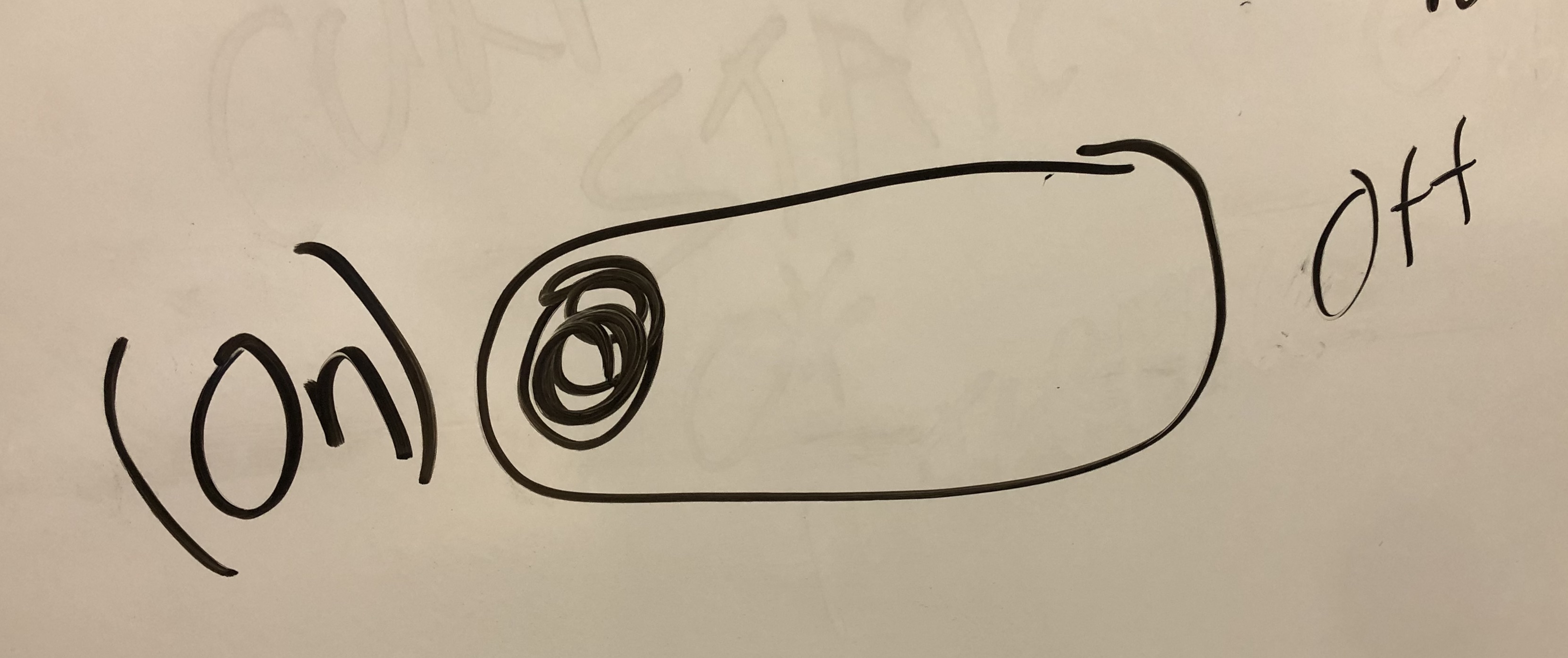
yep that makes sense, so the empathy map i'm talking about it should be like make it on all like word document or something like that, or is there a specific way to maintain implement that's what i'm asking.
well. it's it's basically four quadrants. We require any each quarter, and you can record. These are does says thanks and fields fields party.
yep.
um my question was professionally like let's say make that empathy map i'm asking about like should I write the fourth quarter and on a paper take a picture and then upload it on Maybe I should. make a word document of it in a digital version and then upload it out, there is a specific tab there that says it put your empathy map that's what I must.
know you can either those there are a few different ways, you can go and you can go about it. doing it. By hand is fine, take a picture converted. To PDF and included as a page in the document that you're creating with the rest of yours.
Okay okay. Thank you.
you're welcome.
Okay. anybody else. Not that we don't. And we want to discourage anyone from talking, but I also want to encourage people to talk. So I sent. messages to you half hour before class about breakout rooms. So everyone should have gotten a message about them. So some breakout rooms, maybe work better than others i'm not sure. Any any discussion about that, so there is a comment. In the responses from last meeting that I should encourage people to feel mark feel more free to discuss things in the breakout rooms. So i'm encouraging you to discuss really in the breakout rooms. And in your breakout groups and so. The idea of having. A group.
That persists across.
Our meetings. Maybe. is intended to help. Encourage discussion. Because you're familiar with the people in the group. know what who's in the group. So this is my attempt to improve breakout rooms. Instead of doing them randomly. and on an ad hoc basis. So I put a question in the chat in case, people are more likely to chat about things. OK. So the other question is. There are some so the groups now. we're back to. A regular class. Okay, we got rid of spiritual.
What happened.
So we have two groups with eight and two groups of six. Should I make them all groups of seven.
last meeting. My breakout room breakout one. There was only four people. In our group breakout room so it's. i'm not sure people were dropping out or. whatnot Nice.
I think I. yeah I noticed that too. So we have 41. Participants here so 40 students. i've tried to keep up.
not saying that for people is not enough to have a discussion, but head. yeah it's just surprising. For out of eight are there.
So I can. he's gonna take a quick look at the group's see that level of God, everybody. i'm just if there's somebody is dropped or the names are incorrect and less. than not say no role that's why I was checking to make sure that I had all the students currently in one class. Okay well. Have a little keep it like this and see how it goes, so I noticed there. And I encourage you to have discussions in the breakout rooms and also. take some time to post things you've done in your discussions into the forums for your your group. Okay. there's a question about the definition. Maybe maybe it's good just to review this a little bit. So this page is referenced in the textbook. So here. And if you have a different link for this, if you found a good resources that was a good resource for you that. is not included in. In my list of links, then please share it with me with the class. So concisely so. let's look at the picture first. So. We have user and the world. So. user and any artifact in the world. So, in terms of execution so. Use your says asks of the object of the. The. The artifact. Although I use this. So if it's clear how to use it. Then we have a small then there's not a large golf of execution so it's clear how to use it. So when we use the. Use the artifact. Is a technology. In the way that we think it should be used. So they're also be feedback saying we're using a pair of scissors. So. i'm premier pair of scissors I know I can use them to cut a piece of paper okay so i'm going to grip them in a certain way, and then open them and. So that piece of paper is between the blades of the scissors i'm going to. Make. It open and close and move along the piece of paper. and So I can observe what's the current state of the system what's the current. what's. what's the feedback i'm getting from repair scissors is a cut on a piece of paper. That. That makes sense, as an example. So we know that it's working because we're cutting the piece of paper. So if there's another cutting tool that we have. it's maybe not quite so clear how to use it. Maybe just taking a knife and putting the piece paper on the surface and then we realized that we cut into the surface, as well. So that that gives us some feedback. stuff and maybe if we if we want to keep that surface underneath. Anyway, the idea is that the golf evaluation. Is it. involves the interpretation of the current system state. And the girl who valuation is. As well as the question how do I use the piece of technology. And we use the system. So execution is about use an evaluation is about feedback or understanding. That makes sense.
yep.
So in the in the textbook. We have this example as well. So. what's the issue in this. In that display. But what was the problem, what is the thing that cause problems for the person writing this article. So the one on the left. Is the one she looked at, and she understood the. bluetooth to be on. But then she saw him and another piece of dot and the exam from another. Software manual that on looks different than what she saw her screen. So, how does she interpret the Left screen to be. On. Anybody.
Is it just a lack of communication. Just it's not saying anything more than. offer on so it's. Not implying, whether or not it's the bluetooth is literally on. As in the pci card or on like it's actively searching for bluetooth devices. I think, maybe that's the confusion.
well. So if we think about. What does the off represent. In the left hand picture.
Just bluetooth is off at least that's what I get out of it.
yeah so we can see that it's a saying that bluetooth is off. But, would it be. So no it's not just an incomplete screenshot I hear from the chat. So the idea is. I feel like I should draw a picture here. i'm gonna try this. A little bit here first. let's stop sharing. So there's a switch right. pitching the switch so it looks like it can be so. We have the idea that can move from one side to the other. Women who say off here. that's not necessarily we don't know if it's you're reflecting the current state of the switch. Or whether the off position is over here. You see, where i'm driving.
Jeffrey.
Yes, yes, I understand.
So, if it was the off position switch over there, then by implication. That we on you're here. Because in the plus sign it says what happens when you click the plus sign. So. By extension. sliding the switch would turn the bluetooth off. So not saying one way is more correct or not one way of interpreting it is we can understand that there. there's not just there's not necessarily a single way to interpret. A configuration.
yeah, but I think because of bad they added the blue and the Green shading of it like when you turn it on it's a blues is highlighted, and when you turn it off it's kind of like damn shaded right.
So I think so. That you don't know if you if you're convinced that it's on. Why we don't necessarily then. Think what will what would happen if I change the switch. That makes sense, I mean you only see the on you only see the config rate the display change when you click the switch. So. Yes, if if people would go and click everything on the interface to discover what was going on. They could see oh wait, I see this. The off or the on is telling me the current state of that system. Not in not the. Not the future state if I slid the switch over. So I mean. i'm not saying your explanation is bad or your expectation isn't wrong but not everybody sees it that way. So. This is an example where. Where the golf can be quite large when it seems very straightforward. For some people might be an easy thing. to interpret and for others may not be so easy.
yeah it's a combination of everything right, so I think the first one, the design that blue to switch and stuff they're trying to design it. In comparison with the modern world right like in comparison to the real life world, so the switches literally presence which is like that goes up and down, but as the year progresses that Turner like change it. With that sliding bar and like giving the feedback of like. When you tab or slide It is like a blue, and when you turn it off it's like a great, so I think they also combined the familiarity of this all those years, and people getting used to those things. And the designs and stuff so yeah actually is a combination of everything, so if if we put that smartphone or the. laptop bluetooth thingy in a person who never use the technology for him, it will be like really confusing. But anyone who has any kind of experience with any kind of laptops or any kind of modern technology they will know Okay, this kind of thing is that signifies that is on and off because they have familiarity with those stuff right to over the years and still.
Well, no, I don't agree. it's not every but. The person who wrote the article is not somebody who isn't familiar unfamiliar with modern technology. Right, so you can think of the holistic that we show it show the system status so it's showing system status but it's not showing it consistently. So.
You know I also think they're di interfaces kind of confusing because it's showing the current state but it's not showing that which side is the on position or of position he actually kind of confused for our users. it's confusing I think so yeah so that is larger.
So we. May in the left hand picture may be more clear to not have off. X there.
It shows like yeah it's in the left side is off, but which side is of it doesn't actually mean and in the right side its own but it's not clear that. I am making a turn on like or it's already on.
What I will argue differently um yeah I can, I can say that there will be ways to even further enhance the activity here like we see on the. MacIntosh operating system like they have like the bluetooth symbol on top and it's just the symbol, there is no wording no nothing you just click on it. And there's just a slider that's it doesn't say on off anything is just pop up the color of the blue, then when you turn it off it's just great out and have a cross in it so it's just not highlighted anymore. But in here for me it's like for me it's like clear, because you know the switch on the slider it says first it says the system status of on the Left picture and then the slider you can see it's on the far left hand side right. And when it says on, you can see the switch the black dot actually slides to the further right it's just like a normal switch. In a switchboard or something like that you know, like Okay, if I turn this like in the downside of the upside this represent the state, right now, so. For the left hand side Okay, the switch the black dog is on the further left side and it says off the status of on that side if you slide it to the right side, that is, the Dodd is on the right side now. It says on so you know get that right side is on it would be confusing if it's just like. This Dodd is not there is just like. Is it the dots remains on the same position or the mill, then it would be like really, really confused right again they try to map it with the real world scenarios previously is actually rather than on horizontal slider it used to be like a vertical kind of switch. Like he has to map it with a real world situation, because we have switches in our houses that represent vertical. direction so on the abortion it represent okay this thing is on, and if you put it on a down portrait represents of. But as the year progresses, the change it, but for the better graphics design or something like that and people become familiar with it, and now they're doing it like sliding words. Because right now we are all.
I can, I can propose a solution for this, because yeah there is a to side but it's not referring that we side is often which side is on but it's. Just telling the current system, which I can understand by the difference from the two picture, but if there was two portion and one side was often one side was one now. Then it would be more clear for the users like yeah if I go this time it will be off and different go desert, it will be on, but there is there is two sides what is showing the state.
Can I say something.
sure.
yeah actually what happens is it's a it's a normal symbol it's a it's a it's a dot only so if, like a. Like what I want to say is if we just change this symbol to something else graphically which shows that, which shows, which shows a state like if it is on and what is happening and if it is all, then what will happen so. The men like like that sort of said, like we can change this symbol to a switch so that it like like a toggle switch if we toggle it up, it will be off if if we toggle it down, it will be on and that should be printed on the switch and also there should be a color coding with that. Like if it is off then it's like no color or or something or white color or something else or Gray color and if it is on, then it should be, and that color should be changed to a red or green. So it will be more interactive also and it will convey the message to the user, that what is, what is the current state, and what is happening with a bluetooth and the other.
yeah so that's an important thanks harpreet. that's an important distinction, whether we reflect the current state or the future state, because the plus sign talks about what would happen if you clicked on the plus sign. With the switch the state where it's labeled off on the left hand side of the picture. that's the current state of the bluetooth system, so I think it would be. For me, the graphics are fine, we either. Take the text away. Or you put off on the left hand side and on the right hand side. So, and then you see said toggle it up to turn it off, I would talk with up to turn it on.
yeah that's amazing.
yeah you can you can do either way if it is. up, it will be on, and if it is down that that statement we have.
yeah I just me. so soon there are lots of reasonable interpretations of things. So. To think that everyone in the world should be able to figure it out.
Oh no that's impossible that.
that's more sympathy or maybe even apathy reflecting supposed to empathy.
yeah.
So.
There is, there is no one way to you know cover every single people in the world, so there would be some people who always get confused and there'll be some people who prefer the other choice.
No, I don't want to save everyone there's not one person who's never clear what anything. I mean there might be different people for different.
yeah yeah i'm not suggesting is just one person for them so i'm just saying like. Because they're like very different kinds of people so. The choices they make, and the choices, the live would be very different that that's how the operating system came into place right they are upgrading their system, just to trying to cover the majority of the population that will have a. Good experience well using that right, rather than it's never like okay i'm i'm on a windows system and, like hundred percent of the population says okay that that is the best one or something like that there will be always. Some other people don't be saying looking at this thing is confusing for me, but I prefer to be part or like I prefer ABC X something else other than that.
Okay.
Just focused you're on doing the attendance password which i'm pasting into or chatting chat right now. we're still eight minutes or so to do the attendance of you. can do that. yeah so it it's tough to think about. And there's an example to the talk they talk about the iPad. Or the iPod or knee. that's an example of a you know universal interface yeah.
So actually.
anyway.
If you can Professor just share the top part of your screen I think you're just sharing the browser, but if you can share the top bar so there's also a beautiful example there and we can have a vote like. You know what is better which one is better because I think the apple ecosystem is define a different way and it just made, the problem of on and off right it doesn't say anything is just a blue size slider that's it so it will be a great example countering that the windows example.
I don't know if I can share my whole I don't want to share my whole screen. let's see, I guess, I can do that. Can you see anything.
nope it's just the same morning.
Sorry, I didn't. Look enough times now, it should be.
yeah now on the top. You can see the blue symbol, and if you click on it, then.
I know it's my MAC I.
haha sorry.
You can see the drop down.
Yes.
And there is no wording on it, and I think, maybe this is more preferable to everyone, because it doesn't confuse people anymore.
Well, at least.
it's it's not yes. turn it off it's it's off.
grayed out and off yeah.
yeah.
So the fact of having. A label. you're not seeing all the possible choices for the label. We don't know whether that's. Whether that that reflects. Current the current state or. In the case of the switch switching sliding over to off turn it off. So the fact that we have an incomplete label. Is. decreasing. Pardon me is increasing the golf of evaluation. it's making it harder to. make a. clear determination.
Could we also briefly touch on the fact that we could do the same thing more than one way. Especially when it comes to this example on a MAC because you have control Center as well.
Okay i'm sorry my control Center.
And yeah you could turn toggle the bluetooth right there. And i'm just i'm just thinking in terms of design is that redundancies or what shall we call it.
well. yeah so there were two ways to get to the same place, it looks like so happily, I would say, for apple is the leaves are different, they look different So if I accident from the menu bar. It looks like that, and then, if I access it through the. control panel. looks the same just. so well.
There is a different functionality, if you click on the control panel and the bluetooth like the blue icon you can toggle it off the blue icon you can directly toggle it oh. No purpose of the blue icon on the control panel.
yeah.
The blue I can yeah it will toggle it off.
yeah okay.
So yeah it's like two two ways of doing one thing and giving some user choices.
yeah.Okay.
So that's interesting that. i'm clicking on the. there's nothing there's no indication of the cursor. That I can click on there are different targets here to click on. I. will see the arrow of that. says there's more content. says to me there's more content. But. If i'm clicking on bluetooth the word bluetooth I get to the same plates.
Right now, this status kind of awkward because. When I was like when it was released the new big server version of the always and everyone the tech guys they argued about it, like. what's the point of going to the same place and what's the point of having their without any feedback and. They speculated that they are preparing for a touchscreen MAC book that's why their first introducing the always. like that, so you know, in the future, they can just had the same ways, with a different touchscreen one so that I think is in a transitional state that's why it's confusing because it doesn't give you any feedback when you hover over your cursor on the blue icon.
yeah.
well.
yeah so we can have we've had a good discussion about. switches here there's some other ways. to reflect the feedback as well and. Say new people get more experience on and touch devices. touch screens multi. Large services like phones are now. brings a new new. A new set of. One interpretations or new. set of ways to present information. So. There are lots of choices. And they see we're out of time today, I was going to send us back to breakout rooms. So. I want to revisit again that discussion about selecting your own breakout room so. If you can. think more about that and we'll start at that point. On Friday. And then we'll also. Talk about. If you can also think of your groups. For the project. we'll go over that on Friday as well. Okay, if you haven't looked at the marvel answering machine video please have a look at that. and Have a good rest of your day and Thursday and we'll see you on Friday. So I have an office hour to today. If you want to come back and talk some more. Okay, any questions or concerns i'll stick around for a few minutes as well. Alright, have a great day take care, everyone stay safe.
hello, Professor. hi i'm. In the experiment section I actually haven't attended the was two lectures, as I was traveling from my home country, to Canada, so I just want to know that. How we have to feed our section like do do you have selected for particular section for particular students are are we have to select particular section, no, no.
yeah here, let me. switch back to be our courses here. Okay, so. When i'm asking you to do is name name your section in this, so you can you to grab one. So they're not. In any order. Somehow section 17 got skipped.
Okay.
So you can use.
Okay, the sections that are left. yeah Okay, I thought I thought. You did.
So you should, so the thing to remember is when you get into your courses. is to.
Make sure yes.
Then you can add.
Okay, and. We have to add or assignment indentation has been great.
yeah so. To create the activity in your courses and. Then well and the resource your courses, so those two things. Where it says to add. it's you'll see a button here as an activity or resource.
yeah.
So that's what you. that's where you start on.
Okay.
it's me, yes, it makes sense, thank you okay. Thank you.
And if it doesn't if your questions, you can. quartz quartz. As a student.
We have to post, the activities means we can post any activities of our wish or i'm just confused about that part. Like I did not understand what we have to exactly it was.
It was this one here.
So there's a.
Shell form. asked questions about the individual assignments. So. If you want to ask. This is a good place to ask questions if you have some. assignments. The assignment.
Okay. hey.
So the idea is to. Imagine yourself as a teacher. you're going to create. Some content for your section in your courses. So the content for the section it's going to have an activity that can be graded. And then, based on. grade student receives the student can then access the resource. So you can decide what what activity, they do and what resource they get to you afterward completing the activity. So that that in describing your choices there that's the first part of the Simon. When you go through, and you. realize that in your courses. Know go through and add that. resource as the activity and add the resource you've chosen. And then you reflect on them and create an empathy map. And as you've gone through your courses in the face of the teacher. And then you look for opportunities to redesign come up in your. Your example. That make sense.
Yes, yes.
Thank you so much.
you're very welcome.
Thank you, Professor.
My pleasure.
Professor women, we are discussing discussing about the Gulf about the regarding the interface of Pluto in the windows. I was thinking like. I was thinking of a better solution can I show you. The I found out some picture in the. info i'm in Google and I wanted to show you that it would be much, much simpler simple for the users to understand that we just want to state, and which is opposite.
Okay, so let me enable you to. Share screen. Okay, you can share screen.
Sharing your screen.
Right okay.
So I was thinking this. would be. A solution for our problem, like. There is only two step one or off. And then people can choose easy which one I need to. Do like if I need to turn it on, then I can just put the one button and the Gulf will be less here right I think right.
yeah.
What do you think I mean what do you think of my idea.
So. Having two buttons like that. yeah so they need to be hooked up so that if I press the button the off button up so. so that I can select the on me off saved.
yeah.
So they might be radio buttons. or.
So what do you think. Comparing to the last interface of the windows is conflicts here or still it's not I mean that must significant regarding to that window synchronous.
So. For me who's color challenge. So rena I say the on button has a green ring around it on the off button is a red ring.
yeah.
So there's that. Was color change based on little depressed depressed or not.
So. There should be some features that can understand that can be defined like this, when this is on this link and when the off is on that will blink.
mm hmm. You know.
This is just a sample picture I was just wondering, that if we can just make it so simple that there is one button one for one and then one part of our off, then it would be super simple for the users, what is still there is confusion on site.
yeah, so I think. switches will easier than two buttons.
yeah. yeah that's true.
The issue here is when I approach this interface. I don't know which is all I might say, I want to turn it on or I want to turn it off. So I can just I can just press the honor the off button, but I don't. i'd have a hard time determining. Which is right now.
yeah those are the presenters today is confusing, or we just did is there's no yeah that's true got it.
Okay.
yeah.
i'm super so should we submit the response to meeting every day.
Like there isn't.
yeah you can do that.
Actually I missed the fast food and I figured out that there is a space for us to submit every day sorry about that, and then I started after that and i'm submitting in every day, no.
Okay, so. let's see if I go back to.
The I can turn off the sharing. And there was a portion for auditing, our group is awesome. So how do we actually rated Professor like.
yeah not a semester.
At the end of the session sister.
yeah.
Okay.
um. yeah so here. So when you see this. You get a sense of feedback here. Whether you submitted or whether you missed one.
Mr the fast food than I have submitted after plus five. Every day.
yeah. So the other place right, I have a. reminder is in the calendar. So the upcoming events.
Okay.
what's funny.
Yes, already.
it's already past so. it's letting.
Maybe it helps to some. Children referring to the future, no. Not the future one.
doesn't, so this is an example. leads me here, but then that doesn't give you anything to do. Now there's no feedback, it says. When the other one had said expired. You know so. This could have also shown expired, or something like that.
yeah.
across the different modules and in moodle and your courses there's not a lot of consistency and sometimes.
yeah I can see that.
Anyway, so. That shows up on the calendar. No here. Responses to meetings are in the calendar. Okay, so if you go to activity. When you get.
yeah I already submitted it. I said that the interface for bluetooth in the windows is confusing.
Regarding.
Defining the present and future state of what is it on or off.
yeah.
Last in the last place I am I was having a lot of problem because of Internet connection. So I couldn't actually hear you properly. You taught a very important topic here at the last second patty and golf evolution, so I was kind of. going through the slides I mean not not the slides. Today, what are the block for the in in group regarding they see. So do you think that it is a good source for. Sales sales learning.
yeah so. I think they have a good good resources there. But it's it's not the only one. So I don't mean to. inundate you with lots and lots of links, but. Just try and give you a few. pretty good content.
yeah.
Try to. Go to the. blog by myself and then, if I find anything confusing I will send you a male or I joined our resource.
So I put this wiki here as a way to.
OK OK OK.
as well, but I don't know.
Nobody.
nobody's dancing in. So maybe it's in the wrong place.
No it's not in the wrong place actually people actually thinks. asking a question is the. Creating a. I mean, sometimes some students, like us, on afraid. Maybe. Because. because sometimes questions or is interesting and some questions are like. Some people may find it it's. irrelevant or not interesting. mm hmm so there's a chilly nobody's submitting anything but i'll post some questions I think about empathy maps if I find any confusions.
Okay.
Thank you.
you're welcome thanks you too bye.
Zoom Chat Transcript
good afternoon
so far so good
not bad so far
A little stressful. Beautiful weather though!
not too bad
is this way of doing breakout rooms working for you?
Yes
Yes
Yes
Yes
im fine with it
Yep
yes
yep
I am okay with mine.
yes
yes
No if we scroll down on that page, it shows connected devices too, it’s just an incomplete screenshot
Sourav has made good points. Also take note of the colour feedback
but to look it from another perspective, why is the label "off" on the right hand side on the button
being on the left hand side of the button would have helped
Sourav you are just referring to that switch, also consider that "+"
did we mark attendance?
I think the colour feedback is enough indication that it is on
+ say that it will do and switch says current sate
interface need to have consistency
Great point - current state and future state has some inconsistency here
Student password
I thought our password is Women lol
I thought the same
lol
In design, the space distribution method must be taken into account in order to obtain a successful and distinctive design. Color is an essential element of design, where design needs color to appear more clear and beautiful, and color has the ability to distinguish between good design and bad design, and between beautiful design and ugly design. Accuracy The designer must take into account accuracy in all the details of his design, no matter how small. Objectivity Observance of objectivity is one of the most important features of design, as there must be consistency between all design elements.
Thank you
Thank you!
Thanks, see you Friday!
thanks
Thank you professor
Thank you!
Thank you professor
Responses
What important concept or perspective did you encounter today?
about the radical empathy is that it allows us to notice people and imagine yourself, then take actions which indirectly helps our society to work better.
Today’s meeting was a quite interesting one as our topic of discussion was features of design of a page. I think observer o of objectivity is one of the most important features of design to take into consideration for that Bluetooth toggle bar page.
Learnt a few mew Mac features and I am enjoying the interaction in the class.
It was an quite interesting open class meeting. I really like this way of discussing instead of breakout rooms. Also, i would like to make a note on that Bluetooth toggle bar page. I feel like colour is an essential element of design and there must also be consistency between all design elements.
In the meeting, I learned the concept of design, we need to consider the user experience.
In today’s lecture The most important thing I learned about was how important it is to have consistency in interface designing. We had a good discussion about on/off switch label and “+” task for windows Bluetooth interface. I totally agree with author of that document who was tricked by it. Also read few documents on Radical Empathy + HCI
In Today's class we have learnt about the evaluation and execution. Like every interaction, users must overcome the couple of challenges about understanding the current state of a system and figuring out how to change it. Evaluation: Understanding the state of the system Execution: Taking action to accomplish a specific goal
We talked about evaluation and execution that what kind of interface design make user understand the system by some example.
that there could be so much discussion about an on/off switch!
In today's class we discussed about a real life example of gulf of evaluation and gulf of execution regarding the Bluetooth interface of windows. The gulf is more in this interface as the present state and future state are confusing in the windows interface for Bluetooth.
Is that even simple designs such as the Bluetooth on a computer needs great clarification in the case if someone believes that the other setting indeed is on, it will be hard to convince them otherwise if that is what they have thought to be right the entire time.
emapthy map, switches and assignment 1
It was interesting to see how a simple Bluetooth button display could be the centre of discussion of human interaction with computers. This has opened my eyes in regards to the how careful we should be when designing interfaces
More clarity on the Gulf of Execution and Gulf of Evaluation, especially after reading the textbook and todays lecture to clarify with an example on the board
Today, the class was discussing about different design about the functioning of the switches. There were some interesting ideas about bluetooth switches which intrigued me when it was compared to the gulf.
in today's meeting, I learned how the two UX gulfs work and how to reduce the gap using different attributes of interface.
So the today’s class was so important and we discussed the real life example of the Bluetooth interface for the two UX. In addition I came to know how important the consistency is in the interface design. Last but not least is that I got some knowledge about beautiful and ugly interface design
We started with discussing about our assignment and then carried on with discussing what was wrong with the bluetooth toggle on/off button. This pretty much lasted the whole session and we didn’t have time to go to breakout rooms in the end.
Today we have learnt about the gulf of evaluation and execution works
The discussion about windows bluetooth settings page really peaked my interest. Contrary to other's beliefs, I feel like the button provides all the necessary information and Microsoft did a good job with that. The colour scheme and the dynamic button makes is perfectly clear what the status is
Got to know about how representation can increase or decrease the gulfs.
Today we discussed more about gulf of execution and gulf of evaluation particularly taking Bluetooth design that in what manner it should be designed so that the users can understand it easily & also to overcome large gulf. There were many different views from the students and had a great discussion on that views. Talking about the design of Bluetooth we can enhance it by defining it and giving some explanation or some kind of indications over there and also colors defines the intensions in a better way.
I came to know about how to start with activity assigned to us and in class we also had a discussion on color toggel button which was interesting to listen about. What I feel is the color alone is enough to distinguish the feature of the button so no need to text if its on or off the grey and blue color itself says a lot of things.
In design, the space distribution method must be taken into account in order to obtain a successful and distinctive design. Color is an essential element of design, where design needs color to appear more clear and beautiful, and color has the ability to distinguish between good design and bad design, and between beautiful design and ugly design. Accuracy The designer must take into account accuracy in all the details of his design, no matter how small. Objectivity Observance of objectivity is one of the m
Was there anything today that was difficult to understand?
Is there any way to compensate the golf of evaluation with the golf of execution?
Metrics for gulf. How can we conclude some 'X' implementation has high gulf or low?
Was there anything today about which you would like to know more?
In today's discussion we discussed about how we are going to do the assignment 1. That was so important to discuss because that gave me a clear view but still I want to know more about it.
I would like to increase my knowledge about the two UX Gulfs: Evaluation and Execution. For example, we talked about the Bluetooth icon on the system; how it works and how it is designed.
I would like to learn more about the radical empathy
I would like to learn more about the course final project and the requirements. There is a section on UrCourses, however it is empty.