Now I want to distribute this papers between you. If you don't want to participate into a study or you are not a third year or fourth year undergraduate student, you can pass it to your next classmate.
Okay, great. Yeah, sure, go ahead.
Any questions? Yeah.
If you have any question you can ask me right now. you Yeah. You. gains to use Good. Good evening the students please keep in mind if you want to participate into my study, my email you can find my email address at the end of this paper, so you can easily send an email to me. Just send me just tell me if you want participate into my study after that. Right cable wasn't there no that's. 17 was
thank you so much, everybody. Thank you so much Hepting for giving me this opportunity to present my work into your class. Have a good day.
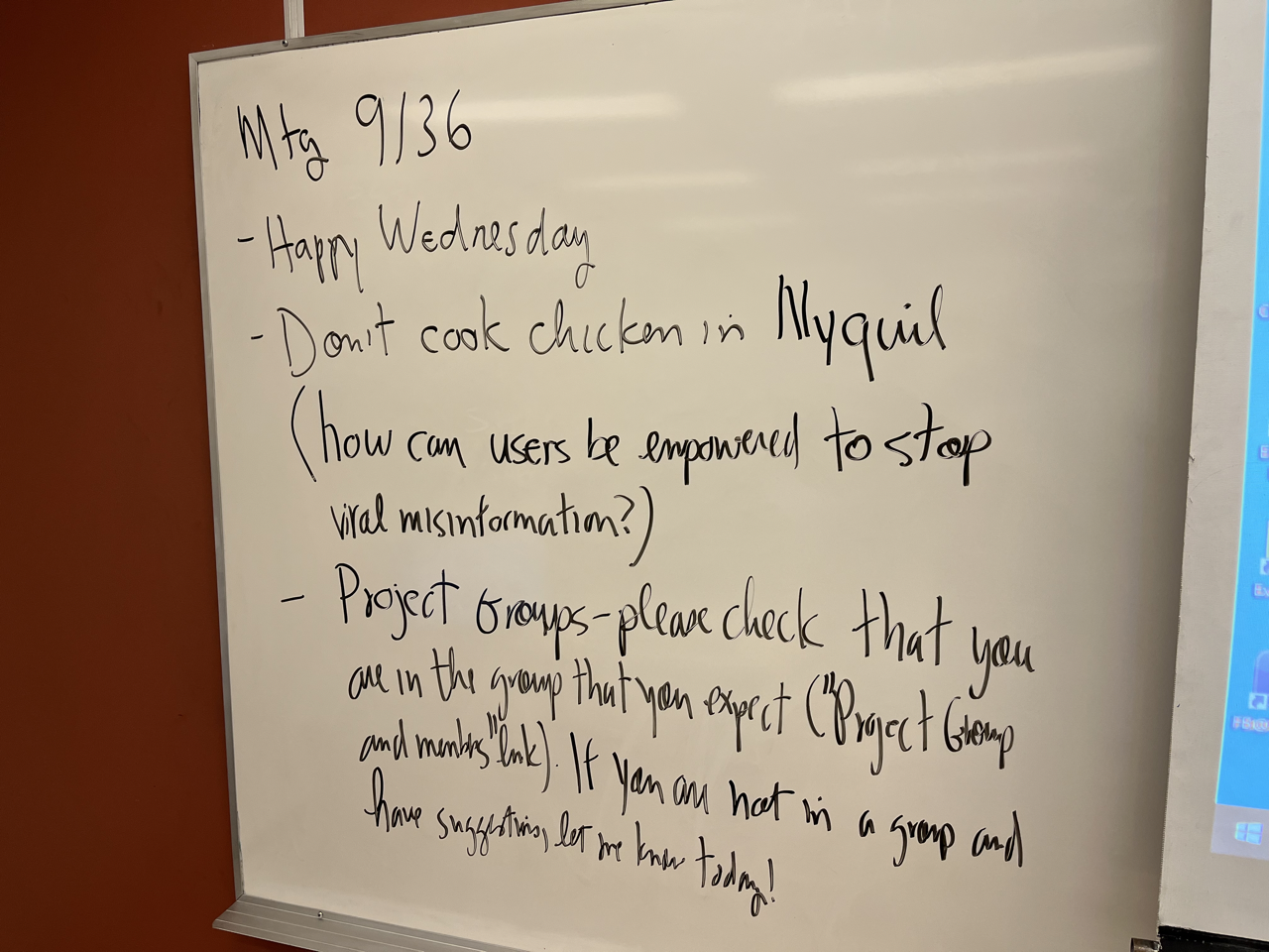
2014 Anyway so here's my public service announcement for today. Don't cook chicken and nightfall I was reading a bit more about that
so my wife told me
she heard about it again yesterday and I said I was speaking to the anchor on the news but apparently it's been around since 2007. Theory sports
Well, the issue is cooking.
Whether the chicken safe to eat and another question but cooking with NyQuil changes, vaporizing some ingredients which could be harmful for your lungs just a bad idea. So maybe a question is
that's the best security. Don't believe
so maybe a question from a user interface. Perspective. Even computer based perspective is out. People respond this stuff be empowered to stop spraying
Okay, so
I want to talk a bit about so I've I've made visible the projects. I think I think things have the correct dates now but I'll double check that the Gradebook matches up with this so the Gradebook doesn't have strange entries in it. I believe so that's in case you can let me know about that. But so if you go to this page, this part of the page and look for project group and members and click there, you should be able to if you have a project group set up, you should be able to see a project group. If you don't see anything here send me a note. I got a note or two yesterday. Maybe I still have I still have to process.
So if you aren't in a group and let me know. And after today I'll fix up people who aren't in groups using my own superior skill of putting groups together randomly. I wouldn't say it's a superior skill but I know I can do that.
Okay, so let me read that. So project groups, please check that you are in the group do spec. And you can do that by clicking on this link private group and members so if you don't see yourself in a group or the group isn't what you expect. So it's not what you expect. Let me know. I'll fix it. If you don't see a group, but you have an idea for a group let me know and I'll set that up. And by the end of today, I will have gone through all the requests and then I will make adjustments I will finish to fill up the groups so ever it'll be in a group aside from people in a 28 who are doing an individual project
Okay, so
if you're in a 28 and you have you'd like to work on your own research, let me know and I'll put you in a group with one. I know it sounds fine to be a group of one but groups is the way it's organized in your course itself. It can be one can be more than one person.
Does that seem okay?
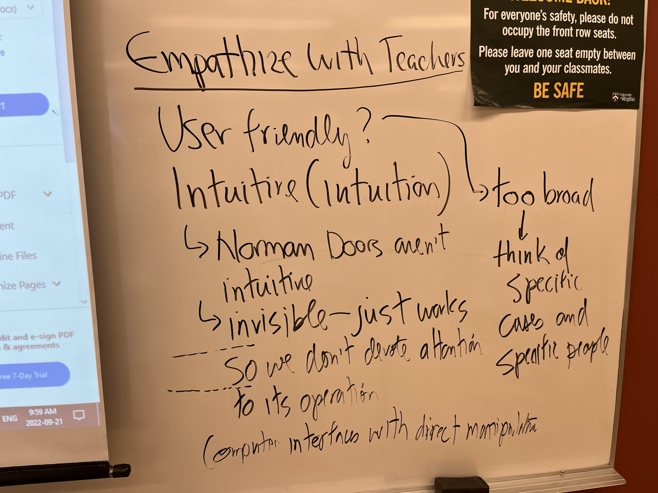
Okay. So we do. So that's the link on the webpage so I want to talk about some ideas related to. Bigger Okay, so the first individual assignment I've asked you to take on the beta teacher for learning role in your courses, any questions and so I want to talk about some ideas related or how we can approach the idea of empathizing with somebody else how we can think about evaluating an interface
so I wanted to thank first of all. So maybe user friendly is a bit too. too broad. Just description for the users and what are what are being friendly to all users or. And, and we can think of some more particular things about user what user friendly is as you get into a more specific case.
So the other
term that we had came up in our discussion the other day was intuition or whether an interface is intuitive and so what what does that mean in practical terms? Am I still speaking loud enough for the back? Yep. Back row. Can you hear me? Okay? Say How can you get the door we're not getting contradictory so Norman doors aren't intuitive because the Norman door is one that behave behaves in a way different from what's indicated.
So, if we can
operate the door without thinking about it, if we see a push a panel on a door that says push and push it, and we go through and we don't encounter a locked door, we don't cover it and kind of resistance and go bang our head against the door because expecting it to open properly that's intuitive. Maybe.
Does that make sense? So what are we doing dealing with computer software? How do we think about an interface being intuitive?
Or do you have something you're laughing with? Me or or neither? Okay, thanks. That's allowed. Well, the others allowed to that anyway,
so maybe something like self explanatory. So, for example, it can go through designing website is one where you can maybe like just drag elements. So you can sign up
yeah. So
So we'll talk about that in a minute. So we might say computer interfaces with direct manipulation so as my writing should i What's what's the lowest point on the board? I should right? So so. live above Okay, I'll try and keep that in mind.
Okay
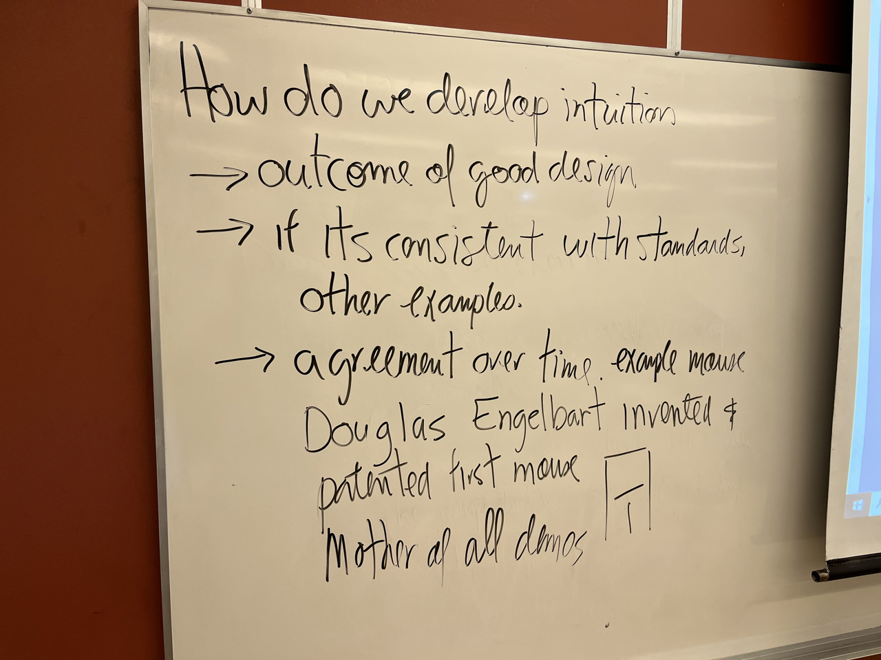
so computer faces allow us to directly manipulate things like drag icons around the screen or a touchscreen, you can move things around, so on. So that's a particular style of interaction that we can can use so the question is how do we develop intuition
so Okay.
So now we can see the outcome of good design is consistent Okay, so the question is if it's consistent with what the rest of the standards I guess results system Yeah, but like yeah, like almost the same thing. everywhere so,
what standards are so maybe we can say, we have an idea of what's an intuitive interface
based on our experience with other interfaces. Control V. Control C and control V for cut and paste. It's developed over the years it didn't happen on the first
1940s When the first computer system and they said let's make a ctrl v. control c control v has cut and paste. It didn't show it exist as a concept so it came about over time.
So, so when we develop new interfaces of new concepts it's a process of trial and error. So some might be better than others anyway.
Could you make the argument of time because some stuff wasn't necessarily intuitive when it came over just over time and got accepted like those designs I think it can be pretty well defined how to use the left click or right click and sometimes the school or extra buttons on the sides but for the most part, every mouse is now left to right click but I remember back in the day used to have like, balls that you can stand there the buttons around the balls and some things didn't even have mice baby computer by example. Tradition so
on the Mac, the most handy one so I'm not sure I know. I know there's a trackpad on my on my MacBook Air. And I don't have the latest version of the mouse. The mouse. So it's an accessory has a couple of buttons that are real, so they can swipe. Yeah. And so I have a trackpad and I can configure one finger, two fingers, three fingers.
I get some unexpected behavior from it. Sometimes I've tried to fix it a little bit with settings but it's it's a little difficult to do I want to tell you the story about the first mouse I didn't even know that the person who developed the mouse to begin with
I thought IBM was the first the first people to make the kind of first business
and maybe the first commercial PC mouse was IBM that wasn't the first design of that anyone heard the name Doug Engelbart before I don't remember the year Exactly. Do you hear you g duck Engelhardt? Yeah. If it's not going to make it better for you if I write Douglas make sure that she is. On so the way it was designed to add some buttons with the bottom and two wheels, one
in the x direction and one in the y direction. So it wasn't maybe as smooth as some of the current designs. So you didn't make a ton of money off that.
But the idea was that's what the idea was from the late 60s So
thanks he gave the mother of all demos. I think it was called The Fall joint Computer Conference in 1968.
We demonstrate a system with a mouse and then for the other the other input devices according keyboard. Anyway and he he later won ACM Turing Award
okay. So I think interpret. So
that brings up the issue of intellectual property and I think that there are some designs that are promoted. Not because they're good but because French and other people's patents are required licenses. So you could
you could see this peculiar ways of being and maybe even pick up your own examples for that
so, intuition is is a good concept to have when we're thinking about interfaces. But it's not it's not separated from context. So our intuition comes from other tools that we're using. So I want to mention. So they're showing you the link. an attendee is really heuristics. Yeah. 9094. So, when we think about using an interface, we can we can have
a measuring stick, so a metric to evaluate design and see whether the interface is good or bad or whether it's just a personal me there are some things that my wife says, or just my my particular ideas about things. So it won't necessarily translate to everybody else.
But using this list, so I'll just read through the list and then we can
so visibility system status. design should always keep users informed about what's going on through appropriate feedback within a reasonable amount of time. There's a match between the system and the real real world. The design should speak the user's language use words phrases, concepts familiar to the familiar to the user rather than internal jargon. should follow real world conventions making information appear in a natural logical order.
user control and freedom. So the users often perform actions by mistake. They need a clearly marked emergency exit to leave the unwanted action without having to go through an extended process so
I using my phone to take pictures and then send them to Dropbox made me feel like I didn't have much control because I had to go through the process of selecting the photos and moving them
and it's a nice feature but I made some mistakes and I did couldn't go back to undo them. I had to start again. So that's an example. So you may be able to think of examples of interfaces that don't follow these heuristics. Consistency and standards. Well, we've mentioned it here. On the last board users should not have to wonder whether different words situations or actions mean the same thing. Follow platform and industry conventions.
Here error prevention, good error messages that are important but the best designs carefully to prevent problems from occurring in the first place. either eliminate error prone conditions or check for them and present users with a confirmation option before they commit to the action. So when you see when you get a series of alert boxes that said, Do you want to confirm and 99 times out of 100 Is it just needs to have a but the ok button clicked. But it's the one time out of 100 where it's really doing something that you need to think about that gets gets hidden in the in the mass of alert boxes that can cause problems. So that's what I think of when I see we'll hear prevention. So recognition rather than recall. So instead of having to recall a command for a certain function we just it's much easier to recognize it. flexibility and efficiency of use shortcuts hidden from novice users may speed up the interaction for the expert users such that the design can cater both to inexperienced and experienced users. aesthetic and minimalist design. interfaces should not can contain information that is relevant, irrelevant, or rarely needed. Every extra unit of information in an interface competes with the relevant units of information and diminishes the relative visibility.
I don't know I think that is that clear. So a bit about the alert box example. We don't want to
we don't want to put more importance information. So that can obscure the really important information. help users recognize, diagnose and recover from errors. Error messages should be expressed in plain language, no error codes and precisely indicate the problem and constructively suggest a solution
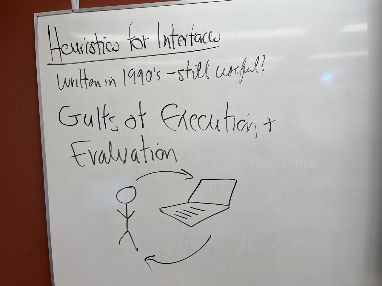
and help and documentation. It's best if the system doesn't need any additional explanation. However, it may be necessary to provide documentation to help users understand how to complete their tasks Okay. In the last two minutes, I just want to introduce this concept of the Gulf of execution and evaluation the example here is in the textbook as well. So we'll talk about it in more detail. On Friday. So we have the user the person using the computer or the artifact So, this is supposed to be allowed to talk so there's information that flows two ways. So the person starts with the idea of accomplishing something they have a goal they like to accomplish maybe recording attendance in your courses. So they have that goal and they can convert that into steps into commands that can be executed on the interface. And then once those steps are taken, or alternatively you just hold on for one minute please for the conversations didn't help very much. Anyway, so the other direction so we can see that the interface is in a particular state. Whether we're on the right page or we have to use navigation but the flow of information this way. The user understands what's going on or what the impact of the commands were. So I think that's one minute late. I apologize for keeping your extra on a Wednesday. Anyway, so we'll pick up there on Friday. Okay. Thanks very much. For today. Is anyone for office hours? I was trying to be good about three and when I say I'm gonna be available I
and help and documentation. It's best if the system doesn't need any additional explanation. However, it may be necessary to provide documentation to help users understand how to complete their tasks Okay. In the last two minutes, I just want to introduce this concept of the Gulf of execution and evaluation the example here is in the textbook as well. So we'll talk about it in more detail. On Friday. So we have the user the person using the computer or the artifact So, this is supposed to be allowed to talk so there's information that flows two ways. So the person starts with the idea of accomplishing something they have a goal they like to accomplish maybe recording attendance in your courses. So they have that goal and they can convert that into steps into commands that can be executed on the interface. And then once those steps are taken, or alternatively you just hold on for one minute please for the conversations didn't help very much. Anyway, so the other direction so we can see that the interface is in a particular state. Whether we're on the right page or we have to use navigation but the flow of information this way. The user understands what's going on or what the impact of the commands were. So I think that's one minute late. I apologize for keeping your extra on a Wednesday. Anyway, so we'll pick up there on Friday. Okay. Thanks very much. For today. Is anyone for office hours? I was trying to be good about three and when I say I'm gonna be available I
Responses
What important concept or perspective did you encounter today?
The user interface Design is the most effecful for any person who is designing the websites or the Interfaces what is for the people understanding and it is the effectful tool for the person who is working on it. If the websites interfaces is very intutive then everything is very clear but the think which is not visible then it is very complex. So my understanding is to deploy such type of UI that will be easy for the understaning but remaining the user privacy policy.
The most important thing I learned in this meeting was the 10 Usability Heuristics for User Interface Design. These rules will be very useful when we create or built a good and successful product to get the best customer satisfaction, such as the system being error free or giving the user the freedom & control such as if they placed an order by mistake, they should be able to modify or cancel it before it's shipped. This access will give the user sense of security and make them feel like they're in control
I have learned about the concept of creating intuitive design today. It gives the chance to think about user centric design by maintaining some standards. I have also gone through some heuristics for interface designing. We can always give the user some control over the interface so that we can get some feedback for improving. But the system should be error preventive and maintain some consistency.
Today in class we learned about the important concepts of intuition and heuristics for interfaces. I thought the concept of inution was especially interesting as sometimes designs can be confusing for users such as Norman Doors.
The different heuristics for designing a good interface.
Today our teacher took about Empathize in UI UX as well user friendly and Intuitive (intuition) and we understand How to do we develop intuition in ui ux : out come of good design if its consistent with standards other example and …
Today we discussed about assignment 1, what is intuitive design and 10 heuristic design principles
Today's lecture was on the 10 Usability Heuristics for User Interface Design wherein, I'd understood the following concepts in the designing of a system's interface, namely, Visibility of system status, Match between system & the real world, User control and freedom, Consistency and standards, Error prevention, Recognition rather than recall, Flexibility & efficiency of use, Aesthetic and minimalist design, Help users recognize, diagnose, and recover from errors & Help & documentation.
We learned about the important concepts of intuition and heuristics of interfaces. Also learned about gulf of execution and evaluation.
A website can and should be made intuitive for easy navigation for the users. This can be achieved when one sympathizes with the user and the developer thinks McDonald’s the user’s point of view and sticks to the norm. New features can still be adde for innovation and creativity if the new functionality can make the process easier and better.
In Today’s lecture we spoke about Assignment 1 (Empathize with Teachers). Also we focused mainly intuition and some examples. Then we wen on to Talk about the 10 Usability Heuristics of an Interface. Also the Two UX Gulfs, Evaluation and Execution.
The balance of the Two UX Gulfs. Today's class examined the challenges people go through in order to interact with different technology environments with their user interfaces. Through an article, two gulfs were brought out of the Gulf of Evaluation and Gulf of Execution. These work in tandem with each other as the system state takes evaluation for the world(system) to connect to the state and evection works in taking a person's actions and connecting to the system. They work together to create a loop.
The most important and new thing I learned today is the gulf of execution and evaluation. The gulf of execution is what the user thinks they can do with the system versus what the system actually does for them. The gulf of evaluation is figuring out how well the system can support the user through the given information of the system state.
The most important thing about today was intuitive and interactive websites
The process in which we develop intuition: if it is considered standard or something we are used to then its considered intuitive design. If we see a software that has a function which is not doing what is suppose to do on other software then it creates a usability issue for users. There will be an agreement over time but until then it is going to create confusion.
Norman door and intuition was very informative. Had a new concept.
In the 9th Mtg Dr. Hepting talked about “Empathize with Teacher” and he asked whether this is user friendly or not? This can be too broad for thinking of specific case and people. Also he mentioned some features of intuitive design like invisible empathy. At the last part the way to develop intuition like: out come of the good design, consistent with standards, and agreement overtime.
10 Usability Heuristics for User Interface Design is very important. Designs should keep users informed about what is going on. Designs should be clear enough to users about what they want easily and also be standard. In a good design it is so important to prevent errors. All the information in a good design are relevant. It is so perfect to give the users help and documentations. In this way, they can find everything fast. Intuitive can help the design well. Norman Doors are not intuitive!
I learned how the design of interface cam effect personal emotions like intuition and empathy. I would also like to learn more that how can an interface attract users.
In today’s class we discussed about how can user be empowered to stop misinformation and after that had more details about our first individual assignment which is empathize with teachers. Should it be user friendly or intuitive?. For it to be user friendly we should think about specific cases and people. The Norman doors are not intuitive. The doors should be invisible means we don’t get distracted by it and get through it easily.
In today's meeting we have learned some points about the empathy map which is our first assignment and then we seen the 10 usability heuristics after that we seen some points on evaluation and execution that we will discuss in detail in our next class.
Making Empathy Map
Heuristic design principles and what is intuitive design.
The most important thing I learnt was about intution and how we can develop it. I learnt different ways it can be possible. Just to add on that also saw an example for invention of mouse
Today we learned about the intuitive user interface and how can one create intuitive user interface.
I learnt about empathy and sympathy in the previous lesson, and today I learned how to execute execution and evaluation, which are both crucial in any ux design. The class began with "happy Wednesday" and discussed heuristics and their usefulness. and I want to learn more about how to perform out and evaluate tasks more quickly. and smarter
Hello Prof. Hepting. Today you talked about the user friendliness of interface design and said that it is too general. Then, you introduced the usability heuristics and specially you discussed about user control and freedom. Finally, you talked about the two UX gulfs which are evaluation and execution. Thanks
Today I learnt how to develop intuition among users while designing the interfaces. Better the self explained and intuitive the design, the user doesn’t have to care about the execution of interface, they can know just by looking at it. Also got to know about important heuristics for user interfaces.
Today we checked attendance and then learned about 10 Usability Heuristics for User Interface Design and The Two UX Gulfs: Evaluation and Execution
We discussed a few points about Empathising with teachers which included:
today some discussions regarding discovery of mouse, intudition and the first assignment was done. in the beginning, prof.abbas came shared his new program for third and fourth year computer science students
The ten heuristic usability and how it is useful but goes unnoticed in everyday designs and several interfaces. Besides that, I also came to know the gulf of execution and evaluation. Moreover, I want to know more about development of intuitive designs.
In this lesson, we mainly discuss The 10 Usability Heuristics and The Two UX Gulfs -- Evaluation and Execution, as well as The directions of The assignment.
The most important heuristic in my opinion is the error prevention one. I usually don't even read the buttons on the 'confirm' alert that comes up when I delete something, I just automatically assume that it is going to be in the same location every time. So, the alert boxes should not switch the position of the 'confirm' button each time just in case I accidentally click the wrong one.
Was there anything today that was difficult to understand?
The most difficult thing in today's meeting for me is the empathize with teachers
The most difficult thing for me to understand is the concept of user friendly. We need to consider carefully to design the UI to be as friendly as possible for user.
gulf of execution was a bit tough to understand for me
Was there anything today about which you would like to know more?
Today Professor discuss about empathy map, and I would like to discuss more about that.
So in today’s meeting we discussed about the user-friendly interface which are easy to use because of the design being so simple. The UI is so interactive and friendly that a user can figure out the functions just by going through it. We also discussed about how to develop intuition, also I would like to know more about how to build an intuitive interface and how to make it more effective..
I would like to learn about the concept of User control and freedom. I thought it was very interesting as it referred to the “emergency exit.” As Dr. Hepting mentioned, even though we might only use these exits 1% of the time, they are incredibly essential in these situations. I remember a time when I accidentally unenrolled myself from a course on UR-self service. I wished there was a confirmation prompt so that I would have gone through the hassle of enrolling again (the class had a big waiting list).
I would like to more about the intuitiveness of the computer interface design as it turns out be really interesting after todays session. In simple words an intuitive design is the one that is easy to use and the user knows what to do right after they start using the product itself. So basically an intuitiveness geneally refers to the unser friendliness design patterns that we are comfortable in navigating stuff through the browsers and able to access the information without any kind or hinderances.
I'd ilke to know more about the answers to the question of how to empower users to stop viral misinformation. More education is one way of preventing misinformation. Censorship on social media like Twitter and Facebook was effective in stopping the spread of viral misinformation. We also discussed about developing intuition. I agree that documenting user experience over time is the best method of developing intuition.
I am curious about knowing the 2 UX gulfs evaluation and execution as it was end of lecture meeting.
Today, we had a discussion about how some interfaces are user-friendly and easy to use because the design is very intuitive. By just looking at the interface, the user can intutively figure out what and where they need to click and/or look. I would like to know more about what the UI/UX design phase looks like in order to build such an intuitive interface. What priorities/goals do the designers have when they are designing an interface that has to be accessible and intuitive at the same time?
About empathy mapping.
Execution and Evaluation are both very important. I feel like in the practical world, compared to the physical responses, people would prefer more visual ones. I would like to know more about the basic theorem related to user experience like these 2 gulfs.
the thing about which I would most like to know more is 10 Usability Heuristics for User Interface Design and how each usability can benefit us and benefit out interface for the better. Also, I would like to know more about the empathy map and how could we feel, say, think and understand the role of teacher and introduce a better delivery for the users without letting them suffer while using our interface.