Mtg 25/36: Wed-02-Nov-2022
Outline for Today
Administration
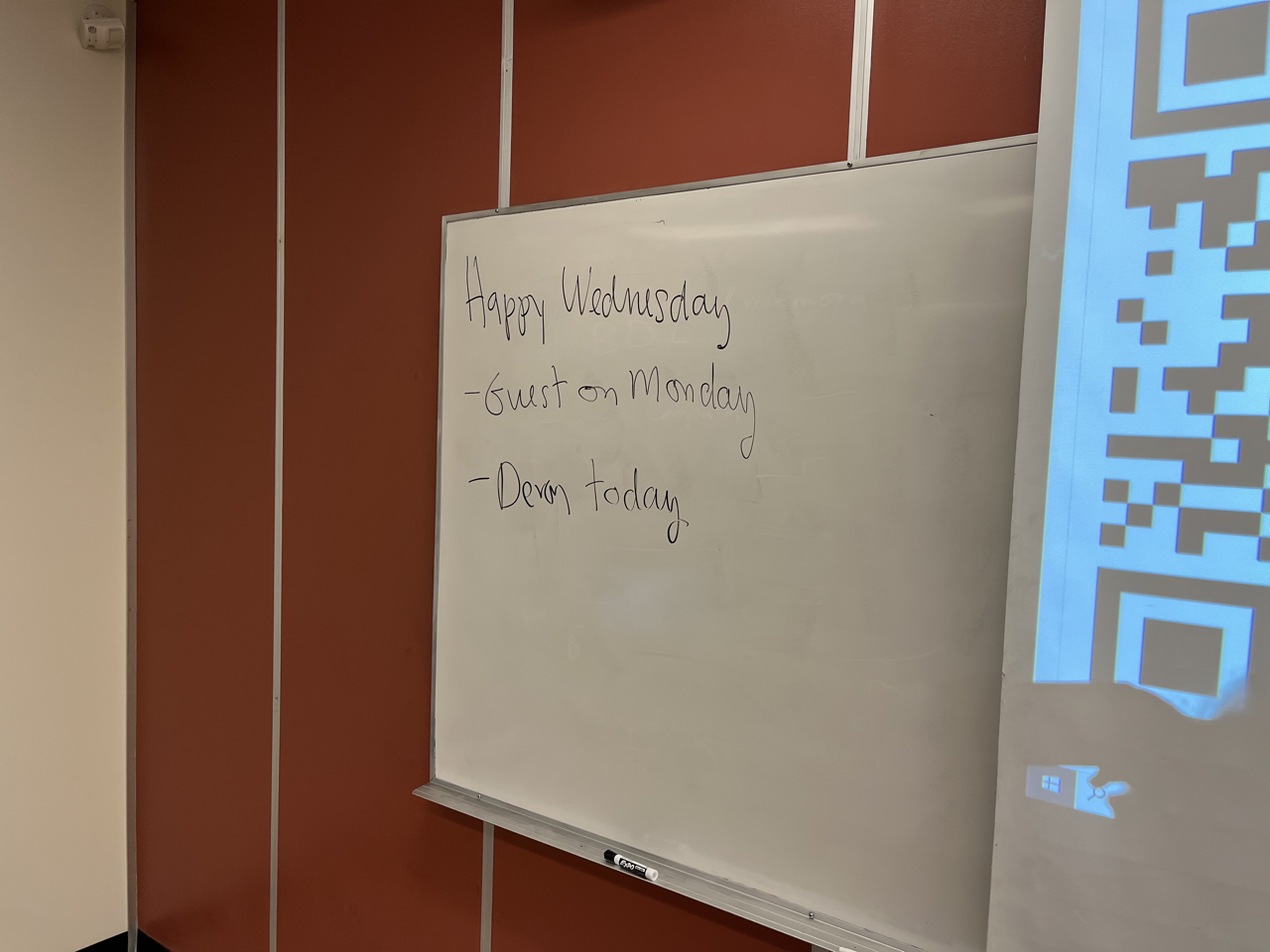
- Happy Wednesday
- Attendance
- Class calendar for today
- Upcoming events
Media
Transcript
Audio Transcript
- I was here trick or treaters wasn't too bad probably well maybe 30 Kids altogether Guys so it says this session I got a message it's telling me when I came here from selling parking
- is it just because it's not an idea?
- I'm not sure what's up with the agenda is when I scan the QR code I left my attendance as a question mark and said that I'm not available to sell market it so yeah, comes on at 930 Should be okay to give you
- one second it's not 930 30
- that's very likely
- yes, I remember when I did that
- I shared this coffee this morning takers for I'll ponder at the end because I'm not much of a candy enthusiast myself. More chocolate country was.
- up so I didn't find this out. I'll try for 20 minutes but I can't make any
- so happy Wednesday everybody suddenly November so any thoughts? About? The guests we had on Monday so we don't have a guest today but class member Devin. Tommy would have probably worked on for the last 100 collapse CS 100. So it might be interesting to hear about that. 20 minutes for that, and then we'll talk some more about making progress on the project so here's the markers.
- I've got my own say don't trust the one to too many type experiences in the lab. Hey, welcome back. So my name is Devin. I was a lead instructor here. I taught CMS 100 lead since 2017. So about five years I've actually spent more time teaching here than I have taken classes, which is a bit strange. But back in 2020 when I was considering what I wanted to do, I was looking at our lead pages. I was looking at the pandemic and I thought well maybe I could just stick around a little longer and fix our pages because you're all CS 100 Score 100 CS students here. You've probably encountered our lead pages, you probably have a lot of very bad things to say about them and so did I. So we want to grants for $18,000 to actually improve these lab pages and that's going to be the project I'm talking about here. So when we were considering this grant, when you have to put in your requirements of what you're going to do to get money, we divided it into a set of categories and the first category we talked about was usability. You can have the best pages in the world but if nobody can actually use them, the mice will not have any pages at all. So they're no good if they're not usable. Now, most of you probably haven't taken CS 100. It's not a requirement for CS. So there's no reason you really would have unless you messed up. But CS 100 If you're not aware of what it is, it's sort of an introduction to computers. It's for the non programming people. It's a required course for business it used to be required for nurses, they took that away. But what makes CS 100 a difficult test to plan for is that you get CS students who took the class by accident because they didn't realize they didn't need it. And you get students that are from areas that aren't so technological. That will tell you in the class they've never touched a personal computer before in their life. So how do you sort of find a balance between that right there is a very large range between your personas. So you got students working full time as well. You got students who just don't want to be there because they hate computers. What do these students actually want? Well, in general, most of these students are going to want lead pages that have easy examples to follow, easy to find information. And I guess for some reason they expect to actually wanting something. But the problem with just planning for students is that they're not going to be your only user in a project. Like this. In fact, on most web interfaces, you will have more than one user target. And the other user target we have here would be our instructors. So we have technically four full time instructors. Right now there's going to be one going on sabbatical every year for the next two years. We actually have three and we have I don't know how many labs, I have not really counted i Six, but they're responsible for teams monitoring 1000s of students within these labs as three people, the other instructors you're going to get our students they hired who probably have not taught before probably weren't trained to well, and in the case of 100 they don't always get CS students applying for that see sometimes get business students you don't even know how the program teaching the class. Now, these instructors are going to have a little bit of a different thing they want out of this. They don't want the lab to change because they've been doing it for so long. They want it to stay the same so they're not delaying anything, because they're already overburdened. Doesn't make them bad people they're just busy. Are people we hire might lack the background to effectively know how to change things as well. Or just lack experience in general on making decisions on what could make our life better. So I'm going to just show what we used to teach on in CS 100.
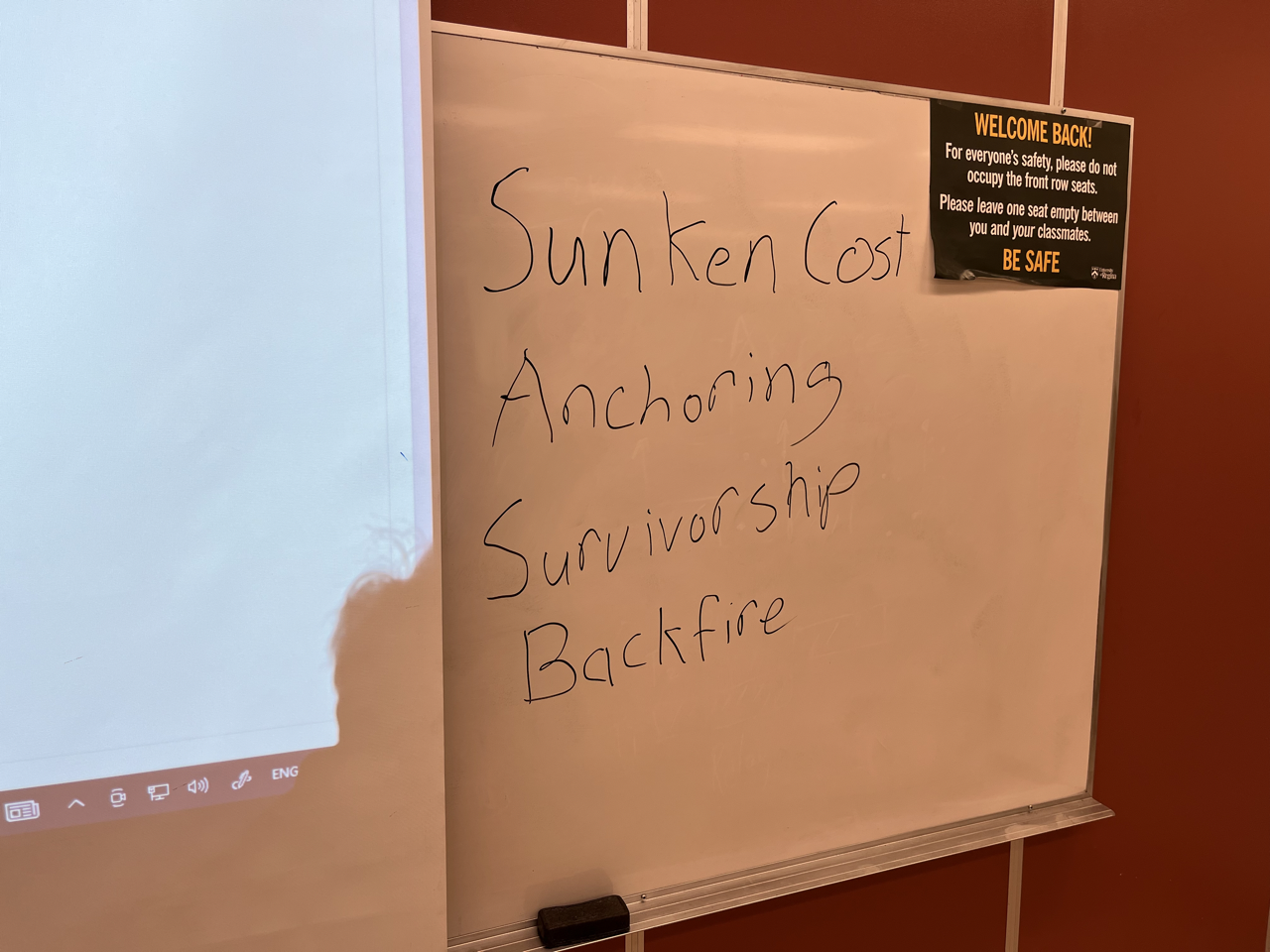
- Like this. So let's go through this pretty quick. And think about everything that's bad. So this is their homepage. We got some reminders here. This had to be manually updated. If you forgot it would show the wrong week. We've got a tab top navigation bar along here. The colors aren't so good in the first place, but many of these links have nothing to do with the lab. We've got webmail your courses the link to the University of Regina website itself, not very useful information and a lot of places they can click on. If you give your user a lot of places to click that go the wrong place. Chances are they're not going to end up where you want them to. Now to get to where we actually wanted them to go. They're supposed to click the lab schedule not entirely obvious. And then we got all of our dates lined up here. They're not up to date because we stopped using this we just show it so they can do demonstrations with it really. But other information about things like their assignment is hidden behind multiple levels of navigation. They had to go what to do. They have all these options. They go checkpoints, they go. We want the first one. And this would be their first assignment. But there are so many levels of navigation here most of which the instructors didn't even know existed, because we're not taught about them so we weren't even maintaining them. So there's like 10 year out of date information on some of these links. But one of the bigger problems was in each week of the labs themselves. So this is our navigation here. It's small, it's hard to click on. And we got links named the same thing. So I tell my students to click basic CSS, it's almost a 5050 If they click the right one and the order of those notes didn't actually follow the order we taught in the lab in the first place. In fact, usually skipped about half of that, because it wasn't even related to what it was teaching. So tremendous problems in 100. So eventually, I just got permission from the department head to just rip this apart and do whatever I wanted with it. But before I show that process is something important you need to consider in designing. Hopefully it's familiar to me. And that is cognitive bias and logical fallacies. a cognitive bias definition is a subconscious error that affects your rationality and logical fallacy is a false or false argument that can be proven wrong with reasoning. In short, we have monkey brains that don't do well. So some there are some important ones to consider when you're doing design like this. The most common one you might be familiar with is called something else. And that you might be familiar with. If you've ever played a mobile game, they have all these little tactics, keep investing and throwing money out there. And any $10 If you like you like the game, they'll throw $10 at it no problem. You need to get what you want in Israel number 10 is to keep throwing money because you've already invested. That is actually quite a problem if we consider designing something cost is important one and why? Because if you're doing rapid prototypes and you put a lot of investment into your prototype, but it fundamentally stuffed then you're going to spend a lot of effort trying to make a prototype that would never work, actually do what you want it to do and function and you're going to waste a lot of time because you don't want to give up on it. Another one to consider is anchoring. This is more important for testing. But anchoring essentially means that a person will prefer the something they already like or the first thing they see. So when you're doing tests and you got to interface is like what you'd have in your assignment. What you do in real testing is that you split your groups and 5050 at some start one started the other. And you do that because by this logical fallacy, they will prefer the first one they see if they have an opinion. If they have an opinion, this doesn't really take into effect but if they don't care, they're just gonna say like the first one that they saw. And you got to get around that by dividing up and showing other ones survivorship. This one is quite important in terms of what I get here with teaching. Survivorship dictates that a lot of people tend to focus only on what succeeded without looking at what failed. Now if I looked at these labs, I had a lot of students I could get 100 I did have CS students after all, but also had some students that did not get 100 In fact, they would fill the course. And it would be very easy under survivorship for me to look at it and say well, these students got 100 These students just clearly weren't doing anything or trying hard enough. And I could just ignore that. Instead of looking into why they were failing. That's a pretty big problem.
- backfire effect another important one. This one is more important if you're working on students. What this one dictates is if you present a logical argument and it's completely sound and you think no one could possibly refute it, and then somebody does anyway, Backfire Effect basically means you're presented with information that contradicts what you feel that instead of acknowledging it and just double down and stick to what you think she's right. The last one for fun, I'm gonna write down the Dunning Kruger effect. That's a fun one. The Dunning Kruger effect basically dictates that people with a below average skill level will tend to overestimate their skill while people with a high level skill level will underestimate their skill. And you might see this in studies a lot. Basically, there's like they'll put out a study. Do you think you're above average intelligence? 70% of people will say yes, which is statistically impossible. So that's the Dunning Kruger effect. Those are some file fallacies and problems you need to be aware of when you're designing.
- Closing slideshow so to go through the rapid prototype process we went through with this lab. I started with MSPaint because in my opinion, if your prototype looks good, you're not doing it correctly. With sunken cost fallacy, you don't want to invest a lot of effort. This was my prototype for the lab page. You can see I wanted to have a light on what section I wanted it to be divided navigation on the side no top nav okay with a tall sample code book sample. And so I did it took me about five minutes. This was my first prototype for the lab page and this was my first prototype for the homepage we got our lead instructor information on the site other helpful links schedule. That's all it needs. In my opinion, if you spend more than 10 minutes on your first prototype, you're wasting your time it's not meant to look good. Now, we never had a actual focus group of students to tell me if this was good or not, but we do have a student society. So I sent these to the students society and they pointed out some useful things like why am I using right here? It makes absolutely no sense. That was a very good point. So I took that feedback and I week later made an HTML no JavaScript, just HTML. And I just copy and one of our web pages that exists to it, but it will go to all our navigation splits the notes, I took a look at what it looked like for that. On pages like this. And drought next year, I would send pictures like this to the students society that told me why it sucked and I tried to fix it to make yourself less. And that was sort of the design process we went through. The final result we get so this is the lead page we're using now. It's got our instructor information. It's got reminders to tell them where to go it's got a schedule down there, the streets pretty zoomed in. But it functions. We've got a room schedules, we got any additional resources they need to know. And the navigation is very simple. If we go into here and it lights up what page they're on so they can visually see what page I'm on. When I clicked on it and follow along a lot easier. It's got recordings. We did a lot to improve the usability. Now it's not a perfect prototype. There was still work that could have been done on it. I don't think it'll ever get done. And he just stuck with this but Anything's better than what we had earlier. So one thing that we were talking about in the last presentation was press personas and scenarios. So you can have a look at what a scenario of a student using this would be. Now I'm from a farming community. So I will just use that as an example. Let's see, we got Billy Bob Joe the farmer. He has worked farms his entire life. His parents hated computers. He never touched a computer because he was never allowed to. But he wants to come to the University and he wants to start up a business while CS 100 is a required course for business so he has to take this class no choice. Some point in August, which is in this school season, August September is hard to see. So you had to go back and focus at farming. They were overburdened and he missed two weeks elapsed and now he needs to catch up. So what would his scenario going through this page? Be? Let's say he missed week two. He's going to load into this website. He's going to have a look at our schedule. And if he's not impatient, he's going to go through the notes one by one. You'll be able to watch the video if he needs you'll be able to go through the notes we have example code at the very bottom about what we did in the lab, and we have what the solution would look like and you would go through those pages one at a time. He'd get to the end results. You do the assignment. That would be a general scenario for this. What Interaction Type would that be? Since that's what you're supposed to consider in your assignment? You can make an argument that that would be instructive. I don't think that's quite right. I think it's explorative because we have the information on the page. They need to explore it, they need to find it they need to record it. And they design metaphor I could use for this since it is a textbook I'll use a library example. When they load into the page, they're presented with a catalogue of information. You know how in the doctor Archer, we have all the fancy letters and maps. Well, these are the aisles of our library
- to figure out which one they need to go into. They go into that aisle. They open a page they open a book they see if the information they want is in the book. If it is they read it if it's not they close it they find another book. That would be the metaphor I would use for this particular design. Could we have used a different metaphor to open up more possibilities? Yes, we could. If instead of doing it this way, I just had a sitemap on the side with a bunch of drop down arrows which I did consider and the drop down arrows would let you access any page at any time. That'd be essentially letting your students walk through bookshelves, right? So that that wouldn't be the same metaphor anymore. You can maybe try called a filing cabinet. You open the cabinet you pick out the folder you want you pick up the file you want. Is that better? Maybe for experienced users, right because then they can take shortcuts, but in my opinion, it wasn't better for my type of users, because unless my students are failing, they should never actually become experienced users to know how to use that system. So those were sort of the metaphors we considered with this and why we made the decisions that led to this now the second category we looked at was accessibility. If you have an accessibility interface, you're actually automatically generally improving usability accessibility and usability are quite related a lot of the time. color themes for example, nobody usually likes the light color theme. We have a dark theme on this page. You can get it from me. Most people I know like dark theme more. We need a dark theme for people that couldn't read the light theme properly. And if it's both people, things like line spacing you have to double space your essays Why do we not double spaced things? On our website? It makes things more readable. Subtitles when video is not everybody likes to have to listen to me I don't blame them and says Howard fit their presentation they refer to W three school not schools but the consortium and the accessibility tools. They had with that. And this is Bart. I just want to talk a little bit about accessibility concerns from this page. Ever since things moved to online.
- Accessible accessibility lawsuits against universities for having terrible little web pages increased by 17 times. It's actually quite a miracle that we never got hit. And many of the things that they cite for these are lack of descriptive alt text when you put an image on a page, there's a thing in the tagging to put posts. What that would do is if the page doesn't load that image to it, put some text on the page instead to describe what it was. Screen readers rely on that to describe an image to somebody who can't see it properly. And if you don't have that it makes your page unaccessible we were relying on PDFs PDFs are difficult for a lot of screen readers. Redundant links and broken navigation, school colors working with the green and gold at the university. It was actually really hard because it's a terrible color combination for accessibility. So I got through articles like this and I went to the W three accessibility same thing SaskPower use, they have a lot of notes and guidelines on how to actually design an accessible interfaces as I said mindspace color themes, rules, context, anything like that they've got guides on that. They also had 167 free tools to help you automatically evaluate accessibility on your pages. And these are the tools that the SaskPower people were talking about. And the one I use and I can show is right here, an automatic color contrast test. All you have to do to use this is put in the name of your site
- it'll go through all your colors and tell you are they good enough for people who have color contrast problems? In this case we made sure they were almost none of the pages in our university actually meet these requirements.
- There was another test that they talked about that sort of gave evaluations I don't remember which one I used. I don't know if it's even still here or if it got bought out. But there are other things like that where you just put in the website and it'll give you a list of things you can improve for accessibility. And we use that that's where I got most of my ideas for how to do with accessible design. So that's about everything important to have to say that I can fit into the time here. So I guess that wraps it up is there a reason that it's separate from the back page? I don't think I can answer that. Yeah, it's because I'm not sure I did the other words.
- I noticed that the settings option on the last page was in the middle instead of the traditional
- Okay, so I mentioned that many of my students don't really know computers, like interfaces and standards. Take that incorrectly. I can. There's a principle in computer science or in design called the locus of attention actually. And that is that when you create the option, the effect should appear somewhere really clicked. Now settings bars in the rights and on the side are pretty standard. That is true. But I was concerned that my students wouldn't see it unless it was from the center because they don't know where to look. So that's why there's a giant box here and that's why it appears right here
- is the website design? Or is this the class designed in a way where students can find everything about the MATLAB session on the website where
- my idea with this was to make it so students don't even have to attend? Because while that might seem counterintuitive, the less people that don't need to be in my lab that don't show up. The more time I have to spend on the people that do so if you could figure out everything I wrote the labs exactly how I teach them the videos match exactly how I teach them. You can figure everything out that we teach just from language.
- In your testing, did you find that clear instructions and instructions sort of substitute videos or
- not does depend on the person. Clear instructions certainly do help because some people aren't going to be in environments where they can watch the video maybe they don't have stable connection. Maybe they just don't like watching it and they just find reading the notes better but I do find that making sure that your notes and the video matchup and they are descriptive and describe everything did make user experience overall better.
- Just calibrated most people prefer adopting when it comes from survey
- when I said most people prefer I said most people I know prefer dark theme. I don't have any sort of statistic on whether that's actually true or not. I find that people I talked to like all of our instructors prefer light theme, which was getting a dark theme was actually quite difficult to convince them we needed it. But I personally can't read half of our pages because they have light blue writing on light backgrounds. So dark theme for me was quite important
- and impossible the way that I can change it to the dark
- No, because like for me like I don't like dark
- eyes when I see website.
- For those who are done like
- oh, well the students in the lab would have their own version of the page and they could bring up on their own computer so they will be able to read and follow along from there so they don't have to necessarily use my dark mode for my presentation. I would just be presenting in dark mode for myself. But if they wanted to read it on their own, they don't have to use the same mode. Good point though. Thanks for sharing
- your experience. Okay, so one take up a few ideas there. So I guess one question I didn't ask you is did you think about responsive design? Be sure that we did everything in percentages.
- And while we can definitely tell
- the page isn't correct, all while
- he says it just takes up the screen
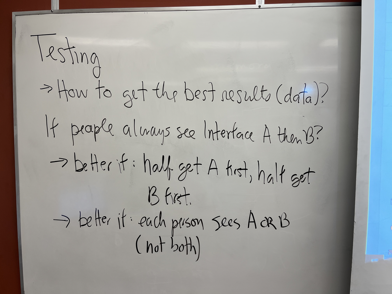
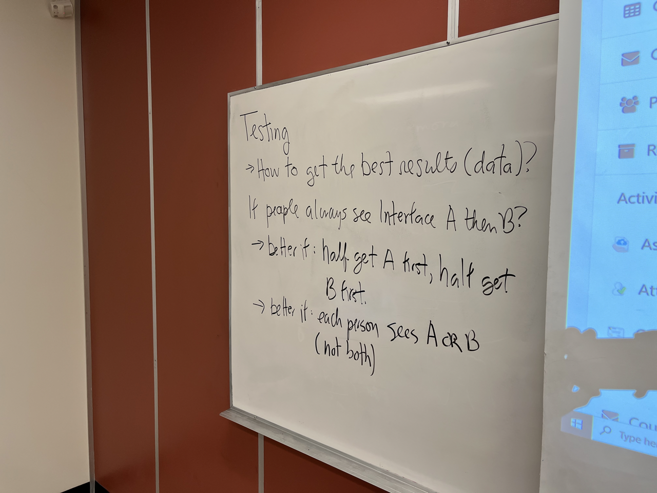
- so talk about testing in more detail after our break, but I just want to mention a couple things. So I mentioned that I mentioned the anchor ship idea. That people are gonna like to see first
- so what are some ways? are getting the best data if we always show people, two interfaces, we show them interface a and then interface b a second.
- So that way we can remove so if we observe in effect well, we balanced the way people see the interfaces that's protect us from bias for the first one so what's another choice? What's another way we can we can get away from the preference of a shopping mall at the same time.
- So what if we don't show everyone both interfaces to show?
- So if we show them both alternatives that's within subjects design. And if we show them one or the other, then we're doing it between subjects design. So the advantages that we're so we're printing less. Instead of spending an hour on two interfaces, they can spend a half an hour in one interface. But the drawback is that we don't get the basis for comparison between two interfaces. I guess if the participants are similar
- then we can
- first things about pharmacy two interfaces but it's not as straightforward to compare simply showing both interfaces and make your own comparisons to hear the way you said between design mentioned. So I'm going to show one or the other that's between subjects.
- To show that both this case in subjects we'll talk about this more later but I just want to
- highlight some some of the ways you can deal with these issues testing issue.
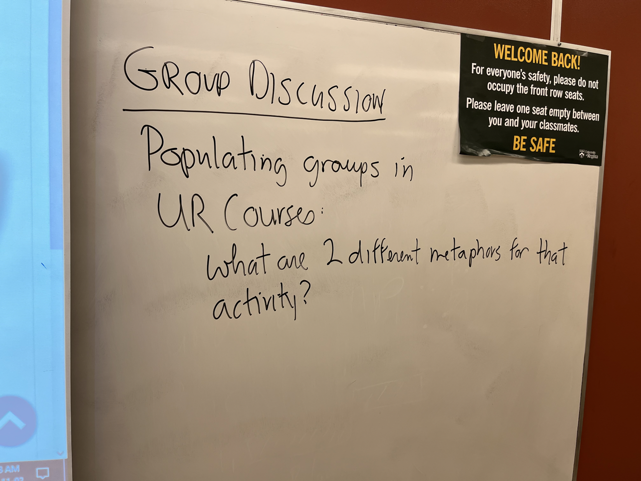
- So we haven't done group discussion activity I thought we might take so we have 20 minutes 16 minutes
- On. Makes sense so I just need have some group discussion time to think about creating metaphors or thinking about metaphors in terms of interface design. So let me while you get yourselves organized. I'll put up the sample screen where we can. We're making groups up soon no one's moving to get into groups. Oh thank
- you Hey, what's going on organize our campaigns
- me Okay, so actually I was a little bit tentative because I wasn't sure it's going to hide student numbers but you can access this interface for yourself in the experiment. You our courses so we have a group as I can have maybe I want to give you something new says Excellent. Anyway, so I don't want to dampen the energy in here with the discussion. Zack clear enough. What I'm asking you to do
- okay
- are we? done because students can change they can get together. So it's very it's actually maybe
- already like changing the nature of things. Central Yeah, actually.
- 27th Oh my gosh, I didn't even know what was going on. Or less supposed to get better? To see it. University Microsoft wake up. Tomorrow right serious I mean, it's up to you. I don't I think
- it's like immaturity. of the system going on holiday
- I forgot you weren't students anymore. You're not students in this set it to be students and that wasn't working and I realized it's teacher for learning beta beta for teacher learning.
- The good thing about making drugs is that you're not getting robbed, you know, you're making assignments and this way yeah, like he just went in this business writing together a prisoner to hear what others are saying morning emails are like university. Yom Kippur shave we how can we relate in Cape Town? You to stop working in office they're not exactly regarded as actually doing volunteer work with a federal offense. In the first album they actually contribute to a friend of mine Ross last couple of seasons for you actually the opposite where we teach you how to do a bit more like we kind of get like a double went really fast to be active seems to be able to do a really good service again actually Oh out at the movies Mr Rogan and because we're talking about TV One question I have always given up my lab you want to important to know that I just want to say
- thanks have a good day.
- thanks have a good day.
Responses
No Responses