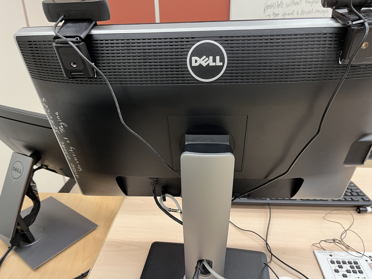
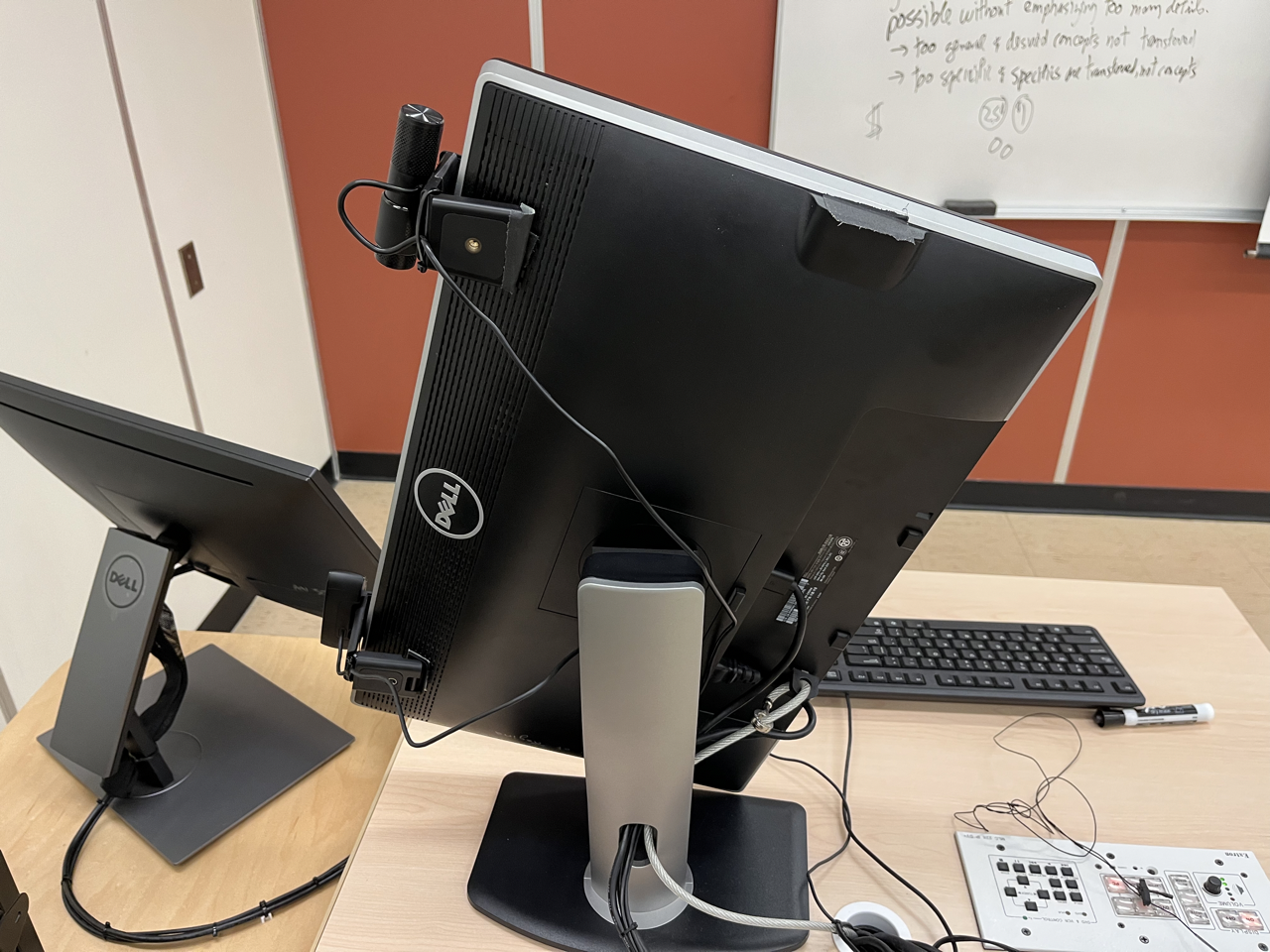
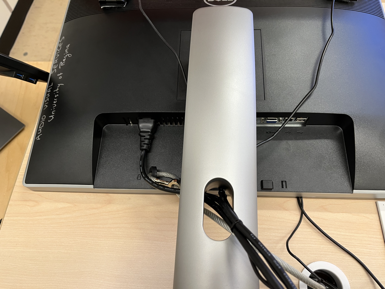
normally at the bottom of the monitor for cable management, usually the neck of a monitor actually has some kind of clip on that you can feed cables through to keep all your cables also keep the cords out of the way out of sight out of mind
so just a big compromise here saying this is maybe a good compromise some users or not so, so if somebody encountered a new scale and it was not technically technically savvy, what would you how would you imagine someone dealing with that call? Maybe services from what I've seen call their technical?
So we can think about whether that this is the best compromise or not. See if I can login quickly how's your weekend? Everyone Have a good weekend? Who makes those pains. So who makes those
Canadian Tire brands so like that weird thing? Like that little Franken character on them? Like, if they were sitting out, um, that was the food option I would eat them but I don't think I purchased
that they just made
me. So I was hoping to have a video that Hamza and Marcille took on Friday didn't seem didn't catch it. So I hope it's gonna get sorted out after class.
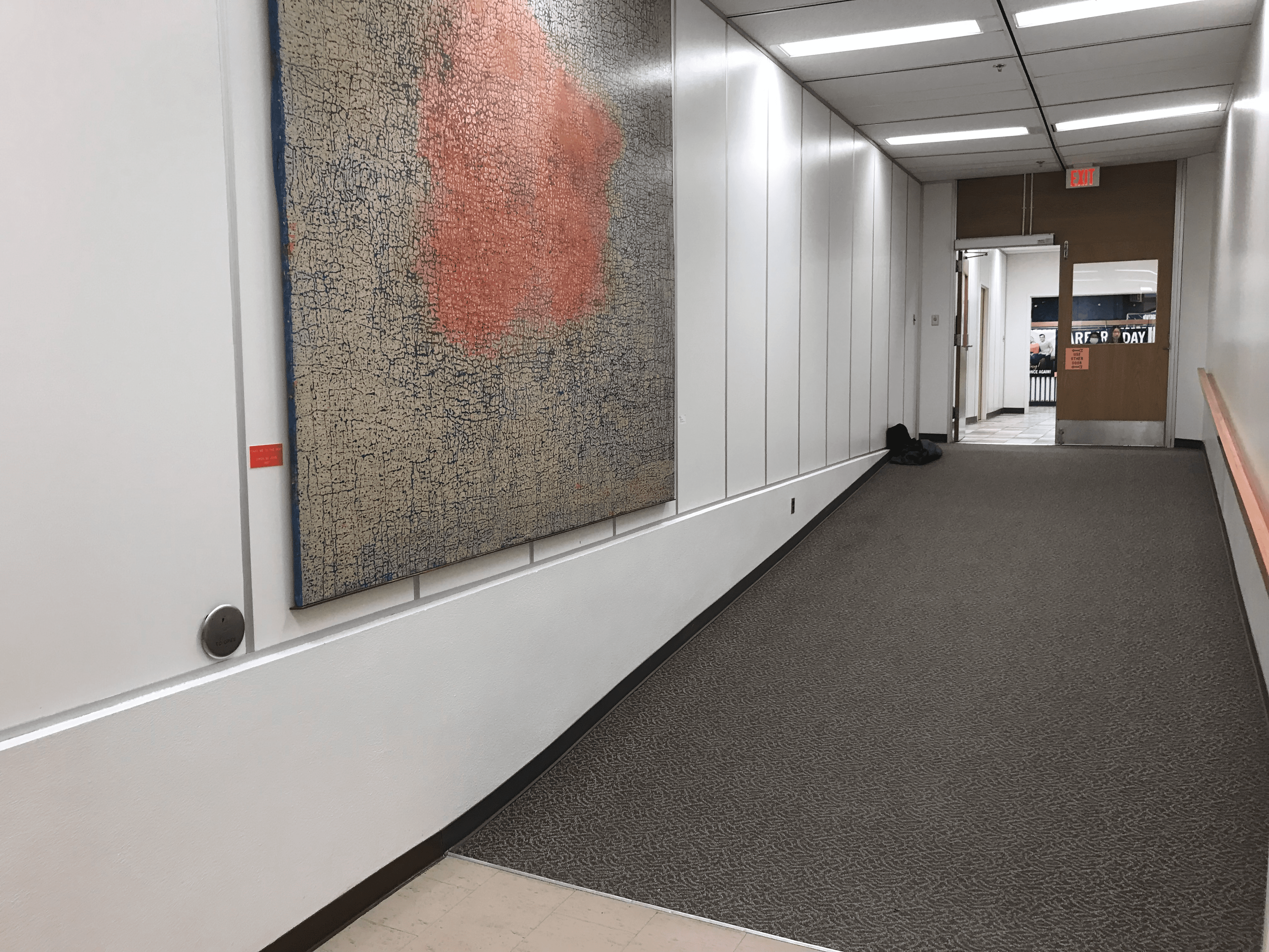
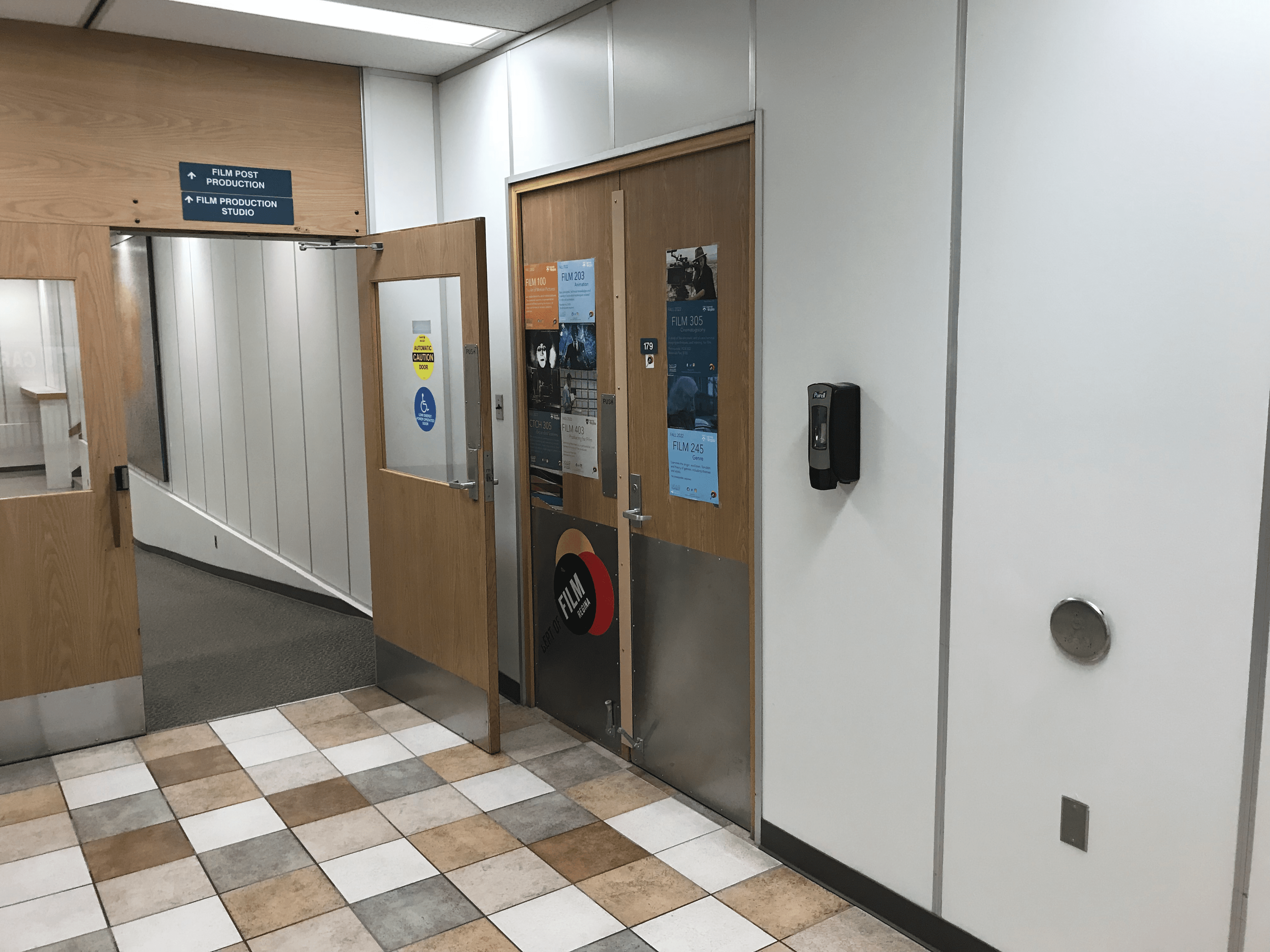
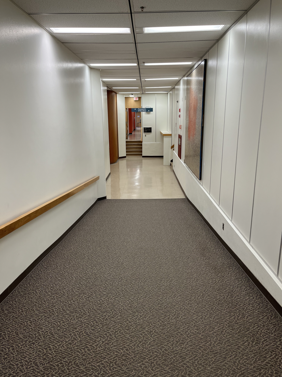
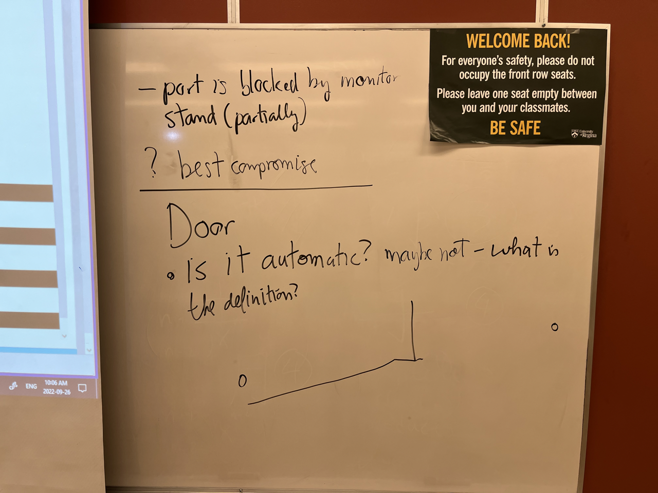
So anyway, here's the password. For today. Here's the QR code right. So anyway, here's a couple pictures of the door so the question is where are the buttons to operate the door? Let's see. So one thing I noticed the question is so is this really an automatic door so judging from the video I took Yes, because it pushes back against me want to try and open filtering the handle. So it does that automatically.
Maybe not, it's not in the sense that we'd expect that nobody has to walk up and and the door open for us does not have a sensor in it on the ceiling to detect when there's movement in front of it. And open the door.
So the other thing is, so if it's not automatic, we have to operate with by pressing a button wherever the buttons located, it just so happens the button on the far side of the door towards the hallway is in this facility here. walked by the sticker can't see it
this case it's also blocked by the sticker but it's further down the far side of this wall between the artwork and the fire extinguisher or defibrillator I'm not sure which one of those things it is
but there's around it's not that steep. The button is here so the question is if somebody is in a wheelchair, navigating by themselves is it is a time to the door is open appropriate for them for the person to come. up the ramp and through the door.
So I included a search for accessibility standards. I didn't go through them rely on documents
let's see if we can find some see if we can find some answers. Okay, so this one is most promising accessibility model standard for the built environment accessibility our doors operator our door operators. So I didn't expect to I didn't expect a statement that said button must be X number of meters and most x meters from the door
a navy so I invite you to look through some resources and see if we can find some standards
we can use to assess whether the door is accessible or not. I wouldn't say it's too accessible. But anyway maybe it's maybe it's a problem if the door stays open too long.
Okay, so there's a little bit of discussion. Here I'll draw the other button. There was some discussion about forming groups last day for the project and I just wanted to indicate that working in groups is is a good thing and helps build character gets you to experience different perspectives even if your group is so you choosing your own groups and you're not necessarily choosing your groups to maximize diversity. But working in a group, you can see that there are different different approaches different opinions, different perspectives that are valuable. And similarly if we're in a group, and we notice, so we might see the areas that are covered by the group members and the ones that are maybe are still
no one covers no one maybe it's there are some areas where people don't cover
cover them out of out of interest, but necessity, say.
So the idea is that groups give you a perspective on working groups experiences, good experience for things you take on after this. That's why we do groups. And in the book, it talks about sort of the different multidisciplinary teams that are put together to do interface design. So we're talking about interfaces like this door, Soldier technical people involved in setting the timers to create the buttons to create the buttons and the timers and the motors and so on the technical things. But then there are also people who are maybe psychologists people working in the areas of accessibility who can empathize and maybe are members of communities who have more greater need for accessibility in the buildings space. So we get a range of opinion and perspectives. And so it's not just that we're trying to imagine what it'd be like if we had to use a wheelchair to navigate campus. You can engage people in radically different experiences.
Does that make sense? That's my microphone working today. Back row. Right Okay, thanks. So let's go back to that diagram. Start drawing just right
good luck.
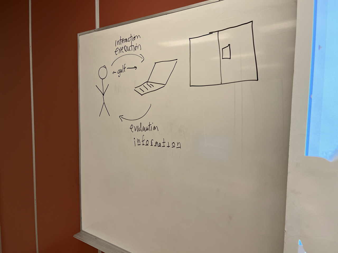
Okay, so here we have the user is a person, obviously a person Sorry, I'll make any console my drawing abilities. So, I have the person and the computer. So what we started talking about the Gulf of execution and evaluation. So out of those Can we talk about recall from our period of discussion how to label the diagram in that way? Anyone? So, we had an arrow going this way, the arrow going this way. How could we label was two arrows.
So another possible label is this as an interaction and what what could this be the court to go with the interaction
starts with the ones I'm thinking of see what I drew the right number of blanks. So you can you feel when I guess the word you can or if you want a letter
information?
Yes. Now let's see for bonus points, and I drew the right number of blanks. Looking good, okay. Right. So, when the user interacts with the system, and the user inter interprets the information presented by the system so if this is if it's straightforward, so we know what to do continue immediately. You see the doors well think I'm drawing too close to the screen.
So let's say lol doors and then our idea of keeping right we have to push on that side. So we could say well, no, we just have to push on that panel to open the door
so the golf This is the conceptual distance between the person and the artifact or the interface. So if it's if it's easy to understand, so we're walking or keeping right in the hallways as we want. We talked about that. Let's say we have on the right hand side or the right hand door, push, we push it and open the door without having to think about here's the door How do I open up than that? Golf is very small. If it's if it looks like the door does in the hallway, the education building then it takes a bit more effort and so the golf is wider. So if if the golf is wider so so there's a golf. You can see it's a twin golf so the execution and evaluation because there's a distance between the user going from what is taking their goal opening the door and deciding what actions to perform. So that's one golf and there's another golf of saying here's the system state. Here's the door. Here's the information the door presents me how do I understand that? side of the door so they're twin girls okay, so don't want to start on your side so what can we do to minimize the design, minimizing the design the sculpts of execution and evaluation of the options so the options
don't know what's necessary.
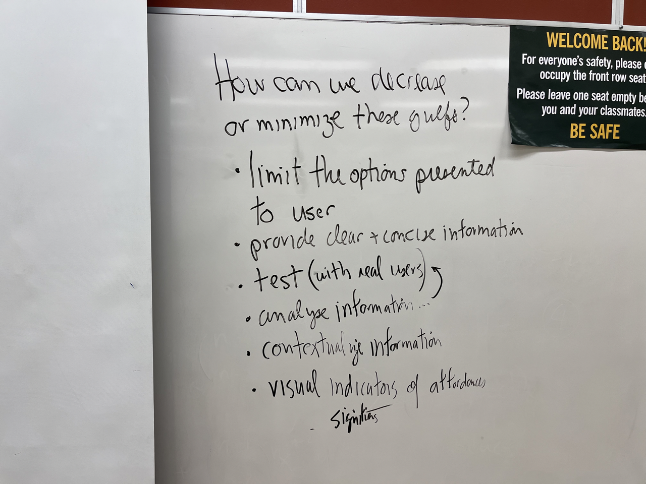
Provide clear concise information. Sorry. Okay, make that one word. Okay, so think about that. Any other thoughts about how we can minimize goals in terms of design? Testing can do testing amazing information saying well more about that. How would you analyze it?
It might be just an extension of testing but getting the actual end user to try it out. Like you mentioned earlier having somebody in a wheelchair accessible a donor more concise way of phrasing. It analyze information from the tests so we can maybe do that as well. So we've mentioned information a few times about.
Visual,
you get a visual or subconscious indicators rather than
documentation books.
The simpler the information is presented on how to use it the better
Yeah, okay. signifiers of different things that you can see and understand as ways to operate interface.
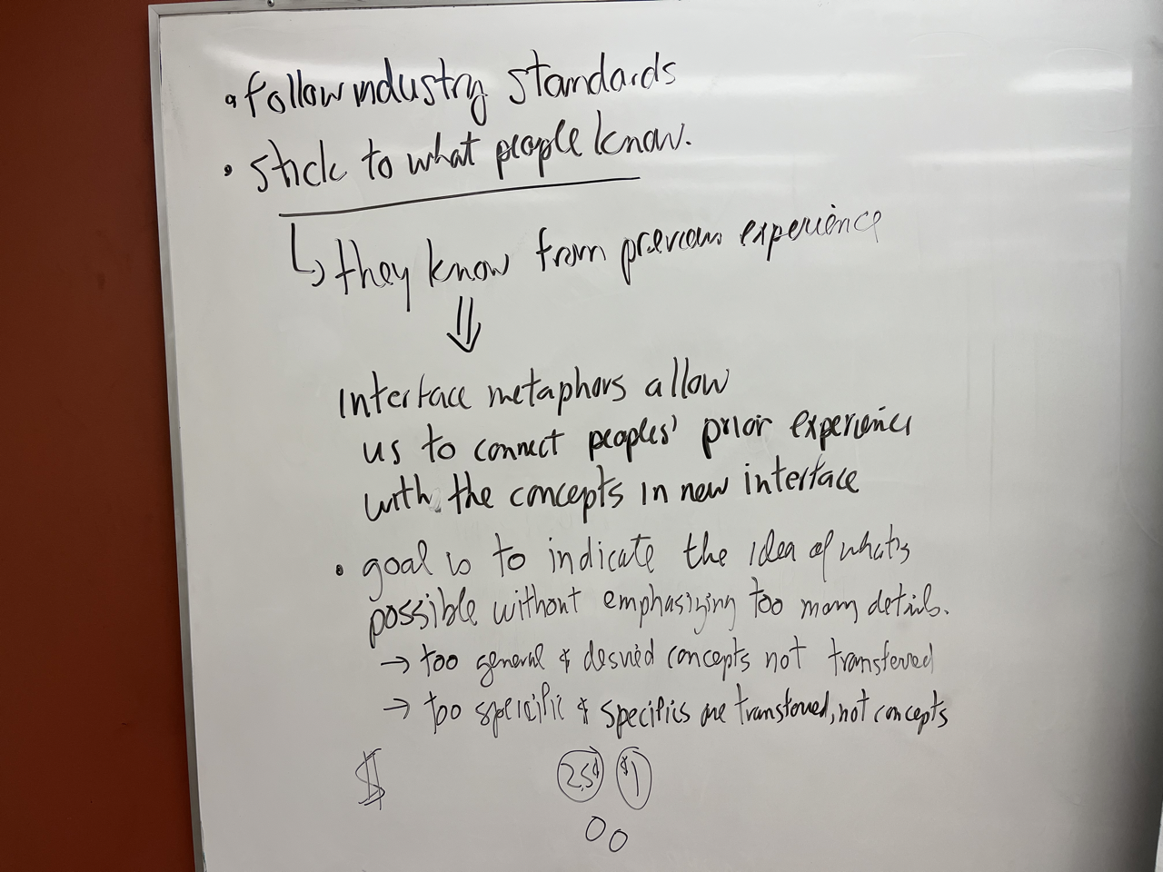
Stick to people
okay. Okay, so we had a little discussion on this the other day
how do we how do we stick to what people know? Or how do people know what
that was the word to start by last week. Random discussion or intuition Okay, so. So they know from previous experience so, we can say the concepts so, a famous metaphor before your time I think probably So, when the when Macintosh
came out with a commercialization of the Xerox PARC desktop interface and then Windows also adopted the same approach with files. So, you can see on the desktop sort of tracking we talked about desktop computers that's a metaphor as well. Where that's the points in metaphor. We're gonna organize things like an office. So on the desktop, we see file folders. We can drag files and put them into folders. And then if we want to delete something we dragged to the trash. And that's not a perfect metaphor for the way things behave because some things you want to throw away you want to move on the Mac, I'm not sure I'll be able to Windows. drag this to the trash and when you delete this when they erase the contents of the desk but it wouldn't remove this from your desktop learns you couldn't access
the files on the disk anymore. So the goal is to stay indicate. idea of what's possible. Without emphasizing too many details so to the desktop metaphor for computer interface works. So we can sort of take the concept of putting things in folders being directories
and organizing files that way but it's not a perfect because he doesn't predict everything that's going to happen. Surface besides tweeting if you make it too general data say to see if we make it to specific.
So let's say we have to imagine that everyone has some useless coins
and paper plastic wheels. So if the interface I should show you something like this $1 sign
what does that indicate to you for say methods of payments in a parking machine if the input slot we put money in is labeled labeled with $1 sign. What would that indicate to you?
I think shape it's a small little like slip points along the horizontal line
bills. And it's just a plastic pad with the NFC contact contactless payment or tap pay that just depends on
the additional context along with it. Okay,
so aside from the additional
context
I won't draw this let's say I was drawing entries or shooting photographs
ever had these coins illustrated would you say that it's possible to put in dimes and nickels What if I just drew this Okay, so is that concept clear enough? I apologize.
You look at it, exactly what coin accepts with a diagram of the coin.
So, the idea is when we're working with metaphors so we can we'll talk about this more next day to think about metaphors. You are operating an interface to go from there on Wednesday. Thank you very much for today. Have a good day. You ever question. Yeah.
So, the idea is when we're working with metaphors so we can we'll talk about this more next day to think about metaphors. You are operating an interface to go from there on Wednesday. Thank you very much for today. Have a good day. You ever question. Yeah.
Responses
What important concept or perspective did you encounter today?
The gulf is related to the execution and evaluation of the design. The execution is like interaction and the evaluation is like the information. Every design should have the value to its user that would be very essential feature. But the design should be optimum as per the user requirements that would be very useful for the the user to evaluate the product quality. The design should be informative as for the all types of the people thus the relative things for the comparatively easier to understand.
We continued discussion about the Norman door and used the Education door that Dr. Hepting showed in previous meeting. We discussed the ways to improve the door and prevent these issues from happening in the first place. The solutions were that we can visualize users using the door and doing test simulations, providing clear information and lastly have real users test the door before it is introduced to the public. Then analyse all of these information to decide if it's a good product for the public use.
To maintain or create a good interface design, we need to ensure that the gulf of execution and evaluation should be minimal. The gulf can be minimized if we provide less confusing and limited options to the user. We can provide clear and concise information to the user and create a testing facility for the beta user so that the most accessible options are generated, which was not possible earlier. Moreover, analyzing and contextualizing information from the user perspective helps maintaining small gulf.
About the gulf of execution and evaluation, hands on experience as a class formulating on those gulfs helped understand how to make use of the premise
In today's class we have discuss about the gulfs. How we can decrease or minimize gulf. Gulfs have limited option to the user, provide clear and concise information, we need to test with real user.
Today we explored the concepts of gulfs of a person’s interaction with an interface. The two gulfs are evaluation and execution. We also learned how if an interface is too specific or too general could impact the gulf of it. I thought it was quite interesting as it’s a concept I never thought of much when interacting with user interfaces prior to taking this course.
In today’s meeting we discussed about the gulf of evaluation and execution and also all the aspects on how we can minimize these gulfs. Concerned was raised among the students about how limiting the choice available to user will make the UI to understand as well as easy to evaluate. It is important to test and analyze the interface when designing the interface.
Today we are discussing about How can we decisase or minimize these gulfs? limit the options presented to user pronde cleur + concise intormation test (with nad user, y analye intonation contestinie information visual indicators, a attendance
Today we discussed about minimizing the gulfs
The most significant thing I learned today was to minimize the gap between the gulf of evacuation and execution in order to enhance the usability of the interface by limiting options to the user, providing clear & concise info, analyzing and contextializing the info, having visual indicators, following industry standards and sticking to what people know. Also, interface metaphors could be used to connect users’ prior experience with the concepts in the new interface.
Is how to minimize the gulf and how ED door will not work for everyone.
The most important thing I learned today is how to bridge the gulfs of execution and evaluation. There are a few concepts such as: limiting the options presented to the user, providing clear and concise information, testing, analyzing information, following industry standards, and sticking to what people know to make the experience more familiar.
In today’s class we discussed how can we minimize the gulfs of execution and evaluation. One of the ways to do that is to follow the industry norms – meaning stick to what people already know. People already have a lot of worry about in their daily lives so using a website should not add to that. It is easy stress-free where even a first-time user can swiftly use the website. The design interface should resemble the outside world.Meaning a shopping cart icon on Amazon.ca is good design interface feature.
After doing some further research, I discovered that in Canada, power door operator buttons must be “located clear of the door swing, but within 1500 mm (5 feet) of the door swing’.
We Spoke more about the Norman doors and a couple of students created a video which we saw in class today. We wondered if the door was automatic? We again spoke about the gulfs of execution and evaluation, and how these gulfs can be minimized. limit options, provie concise info, test real users, analyze infor contextualize info and look for visual indicators.
The most important thing I learned today is that in order to understand what the users view as common knowledge, it's a good idea to perform tests with real users.
The most important that I learned today is mental models
The concept I learned today about evaluation and execution was something I never thought about. I wanted to add a point to making an efficient design is "Keep user in mind". I think that is one of the most important things to build a better design. I would like to get more information on the midterm syllabus
In the diagram drawn in class today with a user and a computer, there is an interaction/execution from user to the computer, and from computer to user, there is an evaluation/information. In between the user and computer device, there is gulf which afftects the interaction between the two.
In order to minimize the interaction and evaluation gulfs, we must limit the options provided to the user, analyze information, provide clear and concise information, test with real users, and contextualize information.
Actually, monitor rotating was for watching the paper size document at once without scrolling!!
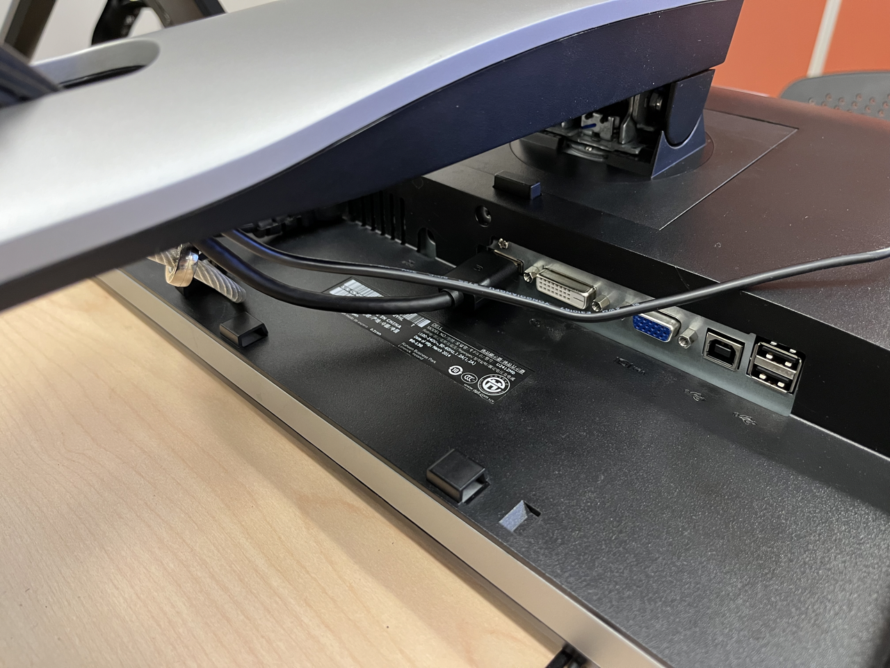
I agree that the monitor partially blocks the ports for the connections but they are located at the back so that the wires do not interfere with the user and for appearance as well. For the ED door, I agree that the automatic sign is confusing. I think it is referring to the handicap button function but it should be more clear. I think providing clear and concise instructions is the most effective way to minimize the gulf between user and computer interfaces.
I learned some of the concepts of making the gulf of execution and evaluation closer to each other.
In the 11th session, Dr. Hepting talked about the importance of industry standards and that a designer should stick to people's knowledge. After that, we discussed how we could decrease or minimize the Gulfs like limit the options presented to a user, providing clear info, testing, etc. In the end, I asked a question about what is the best way to skip the QR/Code for attendance in each class at University. Dr. Hepting raised some issues that can be concerning to solve this problem.
Today in the class I learned about the ways we could bring the gulfs between user and computer closer. It can be done by limiting thr options presented to the user, provide clear and consice information, analyse information and by following industry standards.
Two of the many challenges people must overcome to successfully interact with design are Evaluation and Execution. The first one is understanding the state of the system and the second one is taking action to accomplish a specific goal. These challenges are the “gulf of evaluation” and the “gulf of execution”. It is so important how we can decrease these gulfs. limiting the options, prividing clear information, testing with real users and also analyzing information are the parameters which are so important.
In today's lecture we learned a lot about the Gulf of Execution and Gulf of Evaluation. The thing that stood out to me was about referring to 'push button' doors as automatic because when we talk about automatic doors, I straight up think about not having to do anything to enter through the doors.
Today we learnt how can we minimize gulfs. We learnt how limited options and providing correct information helps. I would also want to learn more how user friendliness can be achieved .
In today's meeting we discuss about the gulf points how to minimize it with proper explanation and important things.
The most important thing I learned in today lecture is how can we decrease gulfs? I learned this goal can be achievable if we are successful in providing clear and concise information with analyzing information before been presented and the presented information should contain just limited options which we provide to user to avoid confusion. Following this steps can help to minimize gulfs.
In today’s class I learned about the different metaphors which we can do for attendance such as signing in, participation awards, fingerprint sensor. And also learned about the size of the doors.
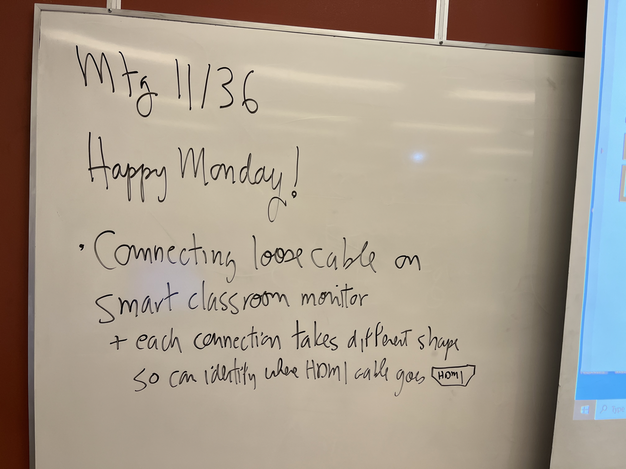
started by wishing us all a happy Monday, connected a loose cable to the classroom monitor, where the port is actually partially blocked by the monitor stand, discussed norman doors, addressed how important it is to form groups and how sharing ideas within those groups is important, and asked how we can we minimize the gulf.
The most important thing that I learned today is various ways of minimizing the gulf between execution and evaluation. The most significant point I could realize that if the user is being displayed minimum options, then they will have not much options but the correct one. Hence, the gulf can be decreased. Also, there are other ways to minimize the gulf which were discussed in the class.
Today we checked attendance and then discussed how we could reduce or minimize guls?Limit the comments submitted to users, provide clear + unambiguous information, and test with real users.
Today we went ahead with the theory part and had fruitfull discussions with the professor and each other .
Today, we talked about the gulf of evaluation and execution and what we can do to minimize/decrease these gulfs. There was consensus among the students that limiting the options presented would make the interface easy to learn and evaluate. If the user is presented with various options without clear or concise information about each, it will be difficult to understand the major purpose of this interface. When designing any interface, always test them with primary end-users and analyze the information.
The factors to keep in mind while designing the interface especially the ones for specially challenged people, as today in class it was discussed that the time it may take an automated door to be kept open for a person in a wheel-chair. I had never thought in this way, so it was really good aspect of designing that I came to know today. so, the standard measures can be a guideline to keep little details in mind.
How to minimize the gulfs.
Tricky doors would be a disaster for users, especially for the people in priority needs. Good design of the input icon for monitors would be some corresponding color and recognizable shapes. Good designs would be straight-forward to the users and no confusion in any cases.
the most important thing that I learned is about the gulfs and how we can analyse and test the information being provided to minimize the gulfs and also that we can do so by limit the options presented to the user. Also, we learned about the usefulness of the educations building door and how is it not really efficient for the people who use wheelchairs.
In today's class, we mainly discussed related contents of group and Mental Models.
The most important thing brought to mind today is to keep in mind that not everyone has the same experiences as me when designing an interface. Even if I fixed all of the issues with the ED door that bothered me, it still wouldn't be a good design because people who use wheelchairs would still have trouble with the door.
Was there anything today that was difficult to understand?
The most difficult thing for me to understand today is the interaction execution between user and the object.
Confused what should we do with the group project still.
I would still like to know more about gulfs I’m not able to understand clearly also need to know about assignment project.
Hello Prof. Hepting. First of all, I appreciate your time because, at the end of the meeting, my friend and I came to you and shared our idea about having an automatic mechanism for attendance, and you kindly shared your thoughts with us. In today's meeting, you talked about the two gulfs of UX design which are execution and evaluation, and you explained it with a diagram. Thanks
Was there anything today about which you would like to know more?
Gulfs of execution and evaluation - How are we getting that information?
How does one consider the balance between a reliable interface in a practical interface? Todays discussion was still on the Gulf of execution and evaluation and i'd like to know more about the design process of keeping them balanced. Also what is the consqieunce of removing features to minimize gulf? If the goal is not to emphasize details why not remove the barriers/features enitrely instead of just the options where they are not needed (i.e certain interior doors not having much use in the first place)?
I would like to know more about decreasing and minimizing gulfs
The discussion about the execution and evaluation of how the communication takes place among the humans and the machines via the gulf which is also called the distance between the computer screen and the humans was a good one. There is tons of information that needs to be explored and would like to dig more into the depth of how this works for the user and computer interactions so that it would be really helpful in the research for this course project. It can really enhance the interactive thinking ability.
We discussed about the ways to minimize the confusion which user faces and the possible ways to provide better solution.
Additional way, other than discussed in class that can be used to decrease the Gulf.